Topic 16 Shiny UI and Server Design
Shiny is a powerful and popular web framework for R programmers to elevate the way people consume analytics for both technical and non-technical decision-makers. It is used in many organizations from start-ups to top-trafficked websites.
You can see from the last lecture that we can create a highly interactive shiny app to engage users in the applications in simulations. This lecture focuses on creating shiny apps for data analysis. The benefits of Shiny in business analytics obvious
16.1 Naming Conventions Revisited
Most programming languages seem to have their own take on how users should name something. This is not the case in R. Actually, R does not have an official naming convention. R community uses naming conventions in many other languages. Below is a list of some of the most common conventions.
myVariableName - lower camel case. This naming convention is used in Java and JavaScript.
MyVariableName - upper camel case / PascalCase. This naming convention is used for class names in many languages including Java, Python, and JavaScript.
my_variable_name - underscore_separated (also called snake case). This naming convention is used for function and variable names in many languages including C++, Perl, and Ruby.
my.variable.name - Period.separated. This naming convention is unique to R and used in many core functions such as
as.numericorread.table.myvariancename - all lower case. This naming convention is common in MATLAB. Note that a single lowercase name, such as mean, conforms to all conventions but UpperCamelCase.
In the shiny library, the lowerCamelCase conventions are used. In the back-end coding, you can use any of the above naming conventions or a hybrid of different naming conventions.
16.2 Working Data Set
This note shows the steps of creating an R shiny application for data analysis.
R Shiny applications are effective tools for exploratory visual analytics. As in other analyses, it is essential to understand the data, know the critical information, and use appropriate tools and effective approaches to convey the information to your audience.
Creating shiny applications is a combination of arts, technology, and science.
In this note, I use the well-known iris data set to illustrate how to create shiny applications in data analysis.
We create two code chunks to explain the two modules (ui and server) separately.
16.3 UI Module: Front-end Design
Graphical Analysis Plan* ()
Scatter plot
Linear regression -inferential table
Prediction
User input information (UI)
Species
Selection of X and Y variable
Input value of X for prediction
I use three different input control widgets in this case study. A list of commonly used input control widgets as well as the code to create the widget can be found at https://shiny.rstudio.com/gallery/widget-gallery.html.
We next design the UI in the following code chunk.
library(shiny)
##  Working data set
##  The iris data set will be used in this app.
iris0 = read.table("https://raw.githubusercontent.com/pengdsci/sta553/main/shiny/iris0.txt", header = TRUE)
x.names = names(iris0)[-c(1,6)]
y.names =names(iris0)[-1]
##
# Define UI for random distribution app ----
ui <- fluidPage(
  # App title ----
    titlePanel("Analysis of Iris Data"),
  ############
  # Sidebar layout with input and output definitions ----
    sidebarLayout(
    # Sidebar panel for inputs ----
      sidebarPanel(
         # Input: Select the random distribution type ----
         radioButtons("species", "Species",
                   c("setosa",
                     "versicolor",
                     "virginica",
                     "all"),
                   inline = FALSE,
                   selected = "all"),

      # br() element to introduce extra vertical spacing ----
      hr(),

      # Input: Slider for the number of observations to generate ----
      selectInput("Y",
                  "Response Variable: Y",
                  y.names),

      selectInput("X",
                  "Predictor Variable: X",
                  x.names),
      ####
       hr(),
      ###
        sliderInput("newX", "New Value for Prediction:", 2.5, min = 0, max = 20, step = 0.1)
       ),
    # Main panel for displaying outputs ----
    mainPanel(
      # Output: Tabset w/ plot, summary, and table ----
      tabsetPanel(type = "tabs",
                  tabPanel("Scatter Plot", plotOutput("plot")),
                  tabPanel("Regression Coefficients", tableOutput("table")),
                  tabPanel("Diagnostics",plotOutput("diagnosis")),
                  tabPanel("Prediction", plotOutput("predPlt"))

      )

    )
  )
)
##
## Server function to be written in the next section for analysis.
server <- function(input, output) {}
## Connection between the UI and the Server
shinyApp(ui = ui, server = server)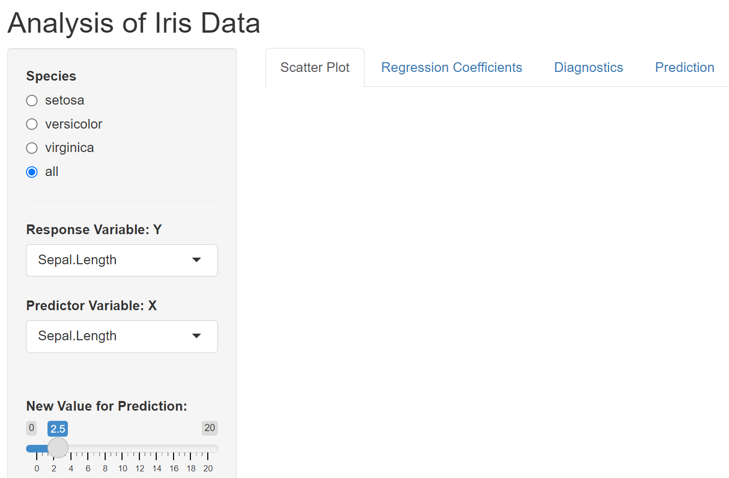
16.4 Server Module: Back-end Coding
In the next code chunk, I copy the UI function written in the previous section and draft the server function.
I use species as a filter variable. I also allow users to choose response and predictor variables to build a linear regression model and use the model to predict by providing new values of the predictor variable.
We chose tabset layout to design this shiny app.
library(shiny)
##  Working data set
##  The iris data set will be used in this app.
iris0 = read.table("https://raw.githubusercontent.com/pengdsci/sta553/main/shiny/iris0.txt", header = TRUE)
x.names = names(iris0)[-c(1,6)]
y.names =names(iris0)[-1]
##
# Define UI for random distribution app ----
ui <- fluidPage(

  # App title ----
        titlePanel(
           h4("Analysis of Iris Data",
                  align = "left", style = "color:navy", br(), br())),
  ############
  # Sidebar layout with input and output definitions ----
    sidebarLayout(
    # Sidebar panel for inputs ----
      sidebarPanel(

            tags$head(
               tags$style("body {background-color: white }")),

         # Input: Select the random distribution type ----
         radioButtons("species", "Species",
                   c("setosa",
                     "versicolor",
                     "virginica",
                     "all"),
                   inline = FALSE,
                   selected = "all"),

      # br() element to introduce extra vertical spacing ----
      br(),
      # Input: Slider for the number of observations to generate ----
       selectInput("Y",
                  "Response Variable: Y",
                  y.names),

       selectInput("X",
                  "Predictor Variable: X",
                  x.names,
                  selected = x.names[2]),
        ####
      hr(),
      ###
      sliderInput("newX", "New Value for Prediction:", 2.5, min = 0, max = 20, step = 0.1),
      ###
      ### The following code adds additional decorative and contact information ########
       hr(),
       HTML('<p><center><img src="https://github.com/pengdsci/sta553/blob/main/image/goldenRamLogo.png?raw=true"
                           width="80" height="80"></center></p>'),
       HTML('<p style="font-family:Courier; color:Red; font-size: 20px;"><center>
                 <font size =2> <a href="mailto:cpeng@wcupa.edu">
                 <font color="purple">Report bugs to C. Peng </font></a> </font></center></p>'),
          ),      # close sidebarPanel
       ####################################################################

    # Main panel for displaying outputs ----
    mainPanel(
      # Output: Tabset w/ plot, summary, and table ----
      tabsetPanel(type = "tabs",
                  tabPanel("Scatter Plot", plotOutput("plot")),
                  tabPanel("Regression Coefficients", tableOutput("table")),
                  tabPanel("Diagnostics",plotOutput("diagnosis")),
                  tabPanel("Prediction", plotOutput("predPlt"))
              )
          )      # close mainPanel
      )          # close sideLayout
  )              # close fluidPage

###################################
###################################
##       Server function
###################################
###################################
server <- function(input, output) {
####################################
##     Some R functions
####################################
#### Subsetting data based on Species
  workDat = function(){
      if (input$species == "setosa") {
          workingData = iris0[which(iris0$Species == "setosa"),]
      } else if (input$species == "versicolor") {
          workingData = iris0[which(iris0$Species == "versicolor"),]
      } else if (input$species == "virginica") {
          workingData = iris0[which(iris0$Species == "virginica"),]
      } else {
          workingData = iris0
      }
   workingData
  }
  ######################################
  #######   Scatter Plots
  ######################################
  output$plot <- renderPlot({
    dataset = workDat()[,-1]   # define the working data set
    #####
    plot(dataset[,input$X], dataset[,input$Y],
         xlab = input$X,
         ylab = input$Y,
         main = paste("Relationship between", input$Y, "and", input$X)
        )
    ## adding a regression line to the plot
     abline(lm(dataset[,input$Y] ~ dataset[,input$X]),
            col = "blue",
            lwd = 2)
  })

   ######################################
  #######   Scatter Plots
  ######################################
  output$table <- renderTable({
    br()
    br()
    dataset = workDat()[,-1]
    # define the working data set
    m0 = lm(dataset[,input$Y] ~ dataset[,input$X])
    #summary(m0)
    regcoef = data.frame(coef(summary(m0)))

    ##
    regcoef$Pvalue = regcoef[,names(regcoef)[4]]
    ###
    regcoef$Variable = c("Intercept", input$X)
    regcoef[,c(6, 1:3, 5)]

  })
  ######################################
  #######   Diagnostics
  ######################################
  output$diagnosis <- renderPlot({
    dataset = workDat()[,-1]   # define the working data set
    #####
    m1=lm(dataset[,input$Y] ~ dataset[,input$X])
    par(mfrow=c(2,2))
    plot(m1)
  })

  ######################################
  #######       Scatter Plots
  ######################################
  output$predPlt <- renderPlot({
    dataset = workDat()[,-1]   # define the working data set

    ###
    m3 = lm(dataset[,input$Y] ~ dataset[,input$X])

    pred.y = coef(m3)[1] + coef(m3)[2]*input$newX
         #####
    plot(dataset[,input$X], dataset[,input$Y],
    #    xlab = input$X,
         ylab = input$Y,
         main = paste("Relationship between", input$Y, "and", input$X)
       )
        ## adding a regression line to the plot
     abline(m3,
            col = "red",
            lwd = 1,
            lty=2)
    points(input$newX, pred.y, pch = 19, col = "red", cex = 2)
  })
}

##
shinyApp(ui = ui, server = server)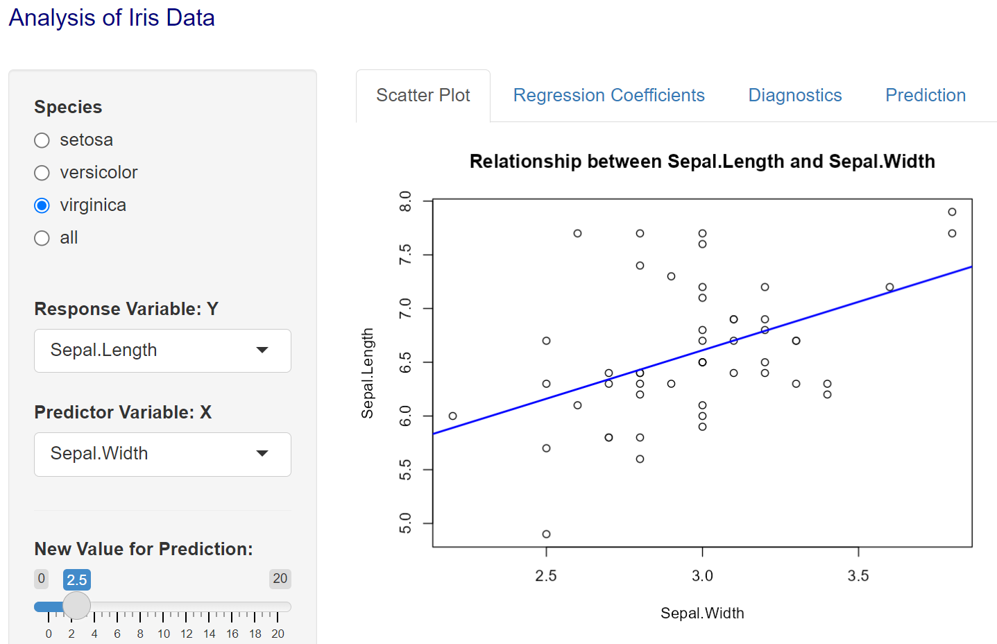
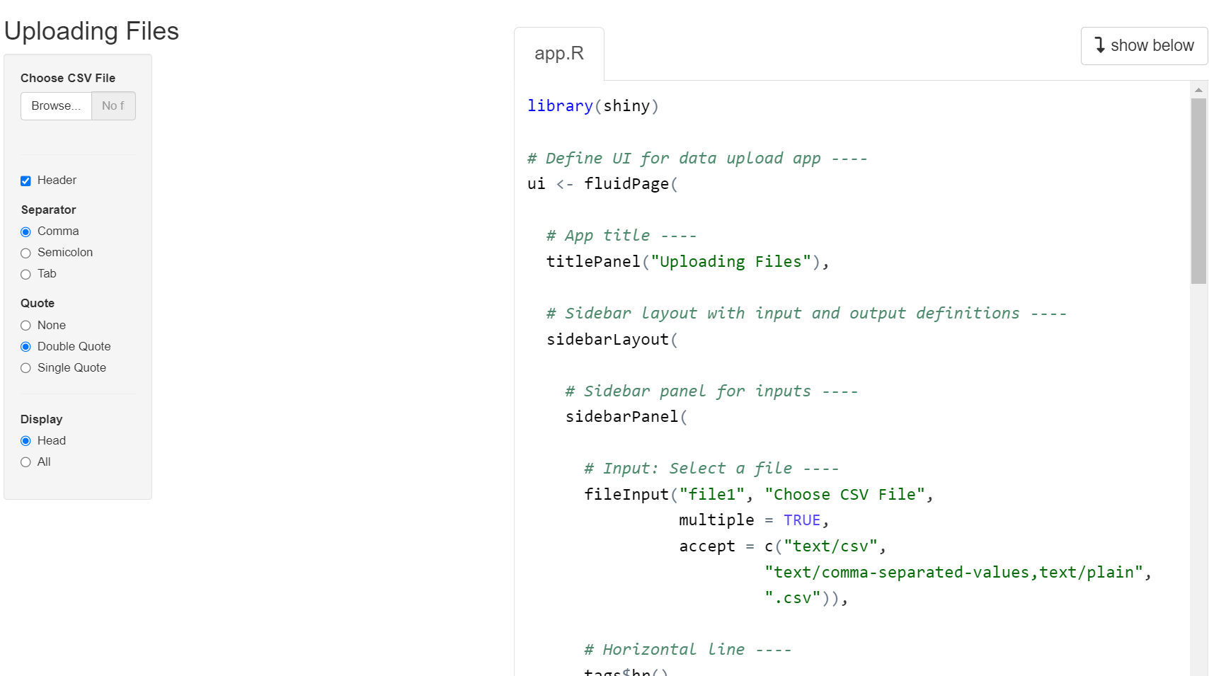
16.5 File Uploading
In the above iris analysis app, we preload the data set before writing ui and server functions. Sometimes, we may want to write an app to perform basic analysis for a given data set, in this case, we need to let the app upload the data set for analysis. That means that we may want to use a file up-loading widget to load the file to R shiny apps.
The following code lists 11 shiny apps for different purposes. We can run the shiny app demo to get a sample code and then modify it for our own applications. For example, the following demo #9 has file uploading capability.
library(shiny)
source("https://raw.githubusercontent.com/pengdsci/sta553/main/shiny/shinyCodeExtractor.txt")
#runExample2("01_hello")        # a histogram
#runExample("02_text")         # tables and data frames
#runExample("03_reactivity")   # a reactive expression
#runExample("04_mpg")          # global variables
#runExample("05_sliders")      # slider bars
#runExample("06_tabsets")      # tabbed panels
#runExample("07_widgets")      # help text and submit buttons
#runExample("08_html")         # Shiny app built from HTML
runExample("09_upload")       # file upload wizard
#runExample("10_download")     # file download wizard
#runExample("11_timer")        # an automated timer
To run a specific demo, you only need to remove the hashtag and run the code chunk. For example, running demo 9, we get something like the following: app + code.