Topic 11 Interactive Maps
There is a very rich set of tools for interactive geospatial visualization. This note introduces various R tools and Tableau to create interactive maps for visualizing spatial patterns.
11.1 Map Types
There are two common ways of representing spatial data on a map:
Defining regions on a map and distinguishing them based on their value on some measure using colors and shading. This type of map is usually called
choropleth map.Marking individual points on a map based on their longitude and latitude (e.g., archaeological dig sites; baseball stadiums; voting locations, etc.). This type of map is also called a
scatter map.
Plotting scatter maps uses geocode and is relatively easier to create. However, a choropleth map is constructed using data with a special structure with shape information. It is relatively harder to construct a choropleth map.
A basemap provides context for additional layers that are overlaid on top of the basemap. Basemaps usually provide location references for features that do not change often like boundaries, rivers, lakes, roads, and highways. Even on basemaps, these different categories of information are in layers. Usually, a basemap contains this basic data, and then extra layers with particular information from a particular data set, are overlaid on the base map layers for visual analysis.
In this note, the basemaps come primarily from the open-data-source-based OpenStreepMap.
11.2 Leaflet Maps
We will use the R leaflet library to create both reference maps and choropleth maps and plot data on maps to display spatial patterns.
Reference Maps*
11.2.1 1. Introduction
Leaflet is one of the most popular open-source JavaScript libraries for interactive maps. It’s used widely in practice. It has many nice features. R package leaflet allows us to make interactive maps using map tiles, markers, polygons, lines, popups, etc.
The function leaflet() returns a Leaflet map widget, which stores a list of objects that can be modified or updated later. Most functions in this package have an argument map as their first argument, which makes it easy to use the pipe operator %>%.
Creating a leaflet map with R library leaflet consists of the following steps.
Create a map widget by calling leaflet().
Add layers (i.e., features) to the map by using layer functions (e.g. addTiles, addMarkers, addPolygons) to modify the map widget.
Repeat the previous as desired.
Print the map widget to display it.
Let’s look at the following simple example.
11.2.2 2. Customizing Marker Icons
We can manipulate the attributes of the map widget using a series of methods.
setView()sets the center of the map view and the zoom level;fitBounds()fits the view into the rectangle [lng1, lat1] – [lng2, lat2];clearBounds()clear the bound, so that the view will be automatically determined by the range of latitude/longitude data in the map layers if provided;
We can also define our own markers and add them to the map object. For example, we use WCU’s logo as a custom marker and add it to the previous map.
# define a marker using WCU's logo.
wcuicon <- makeIcon(
iconUrl = "https://github.com/pengdsci/sta553/blob/main/image/goldenRamLogo.png?raw=true",
iconWidth = 60, iconHeight = 60
)
# define a leaflet map
m <- leaflet() %>%
setView(lng=-75.5978, lat=39.9522, zoom = 20) %>%
addTiles() %>% # Add default OpenStreetMap map tiles
addMarkers(lng=-75.5978, lat=39.9522, icon = wcuicon)
m # Print the map11.2.3 3. Popups and Labels
Popups are small boxes containing arbitrary HTML, that point to a specific point on the map. We can use the addPopups() function to add a standalone popup to the map. When you click the marker in the following map, you will see a popup with the name of the WCU campus.
df <- read.csv(textConnection(
"Name, Lat, Long
WCU Philadelphia Campus,39.9518,-75.1525
WCU South Campus,39.9373,-75.6011
WCU Main Campus, 39.9524,-75.5982"
))
leaflet(df) %>%
addTiles() %>%
setView(lng=-75.3768, lat=39.9448, zoom = 10) %>%
addMarkers(~Long, ~Lat, popup = ~htmlEscape(Name))We can also change the popups in the above map to labels. The modified code is shown below
11.2.4 4. Examples Using Real-World Data
In the following example, we use a few leaflet functions to add some features such as drawing highlight boxes, labels, etc. to the map.
# Define the bounding box using the range of longitude/latitude coordinates
# from the given data set
housing.price <- read.csv("https://raw.githubusercontent.com/pengdsci/sta553/main/map/Realestate.csv")
# making static leaflet map
leaflet(housing.price) %>%
addTiles() %>%
setView(lng=mean(housing.price$Longitude), lat=mean(housing.price$Latitude), zoom = 14) %>%
addRectangles(
lng1 = min(housing.price$Longitude), lat1 = min(housing.price$Latitude),
lng2 = max(housing.price$Longitude), lat2 = max(housing.price$Latitude),
#fillOpacity = 0.2,
fillColor = "transparent"
) %>%
fitBounds(
lng1 = min(housing.price$Longitude), lat1 = min(housing.price$Latitude),
lng2 = max(housing.price$Longitude), lat2 = max(housing.price$Latitude) ) %>%
addMarkers(~Longitude, ~Latitude, label = ~PriceUnitArea)In the next map based on the data, we add more information to that map to display higher dimensional information.
housing.price <- na.omit(read.csv("https://raw.githubusercontent.com/pengdsci/sta553/main/map/Realestate.csv"))
## color coding a continuous variable:
colAge <- cut(housing.price$HouseAge, breaks=c(0, 5, 15, max(housing.price$HouseAge)+1), right = FALSE)
colAgeNum <- as.numeric(colAge)
colors <- rep("navy", length(colAge))
colors[which(colAgeNum==2)] <- "orange"
colors[which(colAgeNum==3)] <- "darkred"
## Define label with hover messages
label.msg <- paste(paste("Unit Price:", housing.price$PriceUnitArea),
paste("Dist to MRT:",housing.price$Distance2MRT))
#labels = cat(label.msg)
# making leaflet map
leaflet(housing.price) %>%
addTiles() %>%
setView(lng=mean(housing.price$Longitude), lat=mean(housing.price$Latitude), zoom = 13) %>%
#OpenStreetMap, Stamen, Esri and OpenWeatherMap.
addProviderTiles("Esri.WorldGrayCanvas") %>%
addCircleMarkers(
~Longitude,
~Latitude,
color = colors,
radius = ~ sqrt(housing.price$Distance2MRT/10)*0.7,
stroke = FALSE,
fillOpacity = 0.4,
label = ~label.msg) %>%
addLegend(position = "bottomright",
colors =c("navy", "orange", "darkred"),
labels= c("<=5", "(5,15]"," >15+"),
title= "House Age",
opacity = 0.4) %>%
addLegendSize(position = 'topright',
values = sqrt(housing.price$Distance2MRT/10)*0.7,
color = 'gray',
fillColor = 'gray',
opacity = .5,
title = 'Distance to MRT',
shape = 'circle',
orientation = 'horizontal',
breaks = 5)11.3 Choropleth Maps
A choropleth map brings together two datasets: spatial data representing a partition of geographic space into distinct districts, and statistical data representing a variable aggregated within each district. There are two common conceptual models of how these interact in a choropleth map: in one view, which may be called “district dominant,” the districts (often existing governmental units) are the focus, in which a variety of attributes are collected, including the variable being mapped. In the other view, which may be called “variable dominant,” the focus is on the variable as a geographic phenomenon. (Wikipedia)
Since constructing a choropleth map requires more coding effort to create a data set with a special structure. The following R libraries need to be used.
library(leaflet)
library(magrittr)
library(rgdal)
library(geojsonio)
library(htmltools)
library(htmlwidgets)
library(stringi)
library(RColorBrewer)These libraries have been loaded in the set-up chunk. Next, we will start with a very simple data set to create choropleth maps.
11.3.1 Loading Data
The sample data contains the unit electricity price for all US states in 2018. We load this data and create a base map that is centered on the geographic center of the US.
11.3.2 Load Map Shape Data
The shape data of the US map is available at https://github.com/pengdsci/sta553/raw/main/data/us_states.geojson. We load the shape data and use it to draw the clear border of states and fill states on the basemap with the same color.
library(sf)
#states <- st_read("C:/peng/eBooks/STA553/us_states.geojson")
states <- st_read("https://github.com/pengdsci/sta553/raw/main/data/us_states.geojson")## Reading layer `us_states' from data source `https://github.com/pengdsci/sta553/raw/main/data/us_states.geojson' using driver `GeoJSON'
## Simple feature collection with 52 features and 5 fields
## Geometry type: MULTIPOLYGON
## Dimension: XY
## Bounding box: xmin: -179.1473 ymin: 17.88481 xmax: 179.7785 ymax: 71.35256
## Geodetic CRS: WGS 84# Since R package {rgdal} just retired, readOGR() cannot be used anymore to read .shp file!
# online geodata converter is also very useful: https://mygeodata.cloud/converter/
# states<- readOGR("C:/peng/eBooks/STA553/img07/cb_2019_us_state_5m.shp")
# states <- readOGR("https://github.com/pengdsci/sta553/raw/main/data/cb_2019_us_state_5m.shp")
m <- leaflet() %>%
addProviderTiles(providers$CartoDB.PositronNoLabels) %>%
setView(lng = -96.25, lat = 39.50, zoom = 4) %>%
addPolygons(data = states,
weight = 1) # weight represents the width of the state border.
m11.3.3 Merge the Map Data with the Price Data
Now we merge. By including all.x = F as an argument, we specify that elements of states that do not have a match in dat (e.g., Guam) should not be retained in the merged object. We can also go ahead and drop Hawaii and Alaska from the merged data frame because they won’t be represented in the final choropleth.
We need to define some rules for coloration. To map colors to continuous values, we use colorNumeric(), specifying the color palette that values should be mapped to and the values. Here, we use the “YlOrRd” palette from RColorBrewer.
Other available color palettes can be found in the following chart.
Alternatively, we can map colors to bins of values instead of doing so continuously. In the electricity cost data, values range from ~7 cents to ~19 cents. We can break this range up into discrete colorable bins:
states <- merge(states, state.electricity , by = 'NAME', all.x = F)
states <- states[!(states$NAME == 'Hawaii' | states$NAME == 'Alaska'), ]
# Define continuous numeric color palette based on the price of unit electricity: YlOrRd
paletteNum <- colorNumeric('YlOrRd', domain = states$centskWh)
##
costBins <- c(7:19, Inf) # define a sequence of integers to pick up the corresponding colors in the given pallet
paletteBinned <- colorBin('YlGnBu', domain = states$centskWh, bins = costBins)11.3.4 Color States Based On Unit Price
colorNumeric() and colorBin() each generate a function to be used when creating a choropleth. States in this choropleth will be colored using the continuous function since the price is a continuous variable.
We now insert paletteNum() in the addPolygons() function below.
m <- leaflet() %>%
addProviderTiles(providers$CartoDB.PositronNoLabels) %>%
setView(lng = -96.25, lat = 39.50, zoom = 4) %>%
addPolygons(data = states,
# state border stroke color
color = 'white',
# soften the weight of the state borders
weight = 1,
# values >1 simplify the polygons' lines for less detail
# but faster loading
smoothFactor = .3,
# set opacity of polygons
fillOpacity = .75,
# specify that the each state should be colored per paletteNum()
fillColor = ~paletteNum(states$centskWh))
m11.3.5 5. Labeling Cost Information
We’ll use sprintf() in combination with lapply() and HTML() (from library {htmltools}) to generate a formatted, HTML-tagged label for each state.
The cbind() statement stitches the labels onto the states objects. The labels can be included in the choropleth by adding a label = argument in addPolygons(), and labelOptions = provides additional customizability (label color, etc.).
11.3.6 6. Finalizing The Map
Finally, we’ll take advantage of Leaflet’s interactivity features by adding a highlightOptions = argument as part of addPolygons(). This allows us to define a response for sections of the map when a cursor passes over them. We’ll keep it simple: While being moused over, states will be emphasized by a blue line.
m <- leaflet() %>%
addProviderTiles(providers$CartoDB.PositronNoLabels) %>%
setView(lng = -96.25, lat = 39.50, zoom = 3.5) %>%
addPolygons(data = states,
color = 'white',
weight = 1,
smoothFactor = .3,
fillOpacity = .75,
fillColor = ~paletteNum(states$centskWh),
label = ~stateLabels,
labelOptions = labelOptions(
style = list(color = 'darkred'), #list(color = 'gray30')
textsize = '10px'),
highlightOptions = highlightOptions(
weight = 3,
color = 'darkred' )
) %>%
addLegend(pal = paletteNum,
values = states$centskWh,
title = '<small>Avg. Cost<br>(cents/kWh)</small>',
position = 'bottomright')
m11.4 Plotly Map
plotly aims to be a general-purpose visualization library, and thus, doesn’t aim to be the most fully-featured geospatial visualization toolkit.
plotly uses several different ways to create maps – each with its strengths and weaknesses. It utilizes plotly.js’s built-in support to render the basemap layer. The types of basemap used in plotly are Mapbox (third party software that requires an access token) and D3.js powered basemap. In other words, plotly does not use OpenStreetMap that is used in leaflet, Mapviewer, ggplot2,Shiny, and Tableau.
We will not use Mapbox in this note and focus on the D3.js basemap that does not have many details. The plot function plot_geo() will be used to make quick maps.
In the following, we will introduce the steps for creating Choropleth maps. Since Choropleth maps need to fill and color small regions such as district, county, states, etc., it requires the data set to have a special structure that contains shape information. Two plot constructor functions plot_ly() and plot_geo() will be introduced to create choropleth maps.
plot_ly()requires specifyingtype = choroplethto make a map (basemap from plotly.js). Information in the data set is integrated into the maps by various arguments ofplot_ly()and relevant graphic functions that are compatible withplot_ly().plot_geo()requiresaddTrace()to make choropleth maps and integrate data information to the maps with relevant arguments inaddTrace()and graphic functions compatible withplot_geo().
#### Choropleth Maps with plot_ly()
In general, making choropleth maps with plot_ly() requires two main types of input:
- Geometry information provided by
- one of the built-in geometries within plot_ly such as US states and world countries. See the following example 1: Visualizing 2018 electricity cost per state.
- a supplied GeoJSON file where each feature has either an id field or some identifying value in properties. See the following example 2: visualizing the unemployment rate of US counties
- A list of values indexed by feature identifier. They control the features in the map including boundary, filled colors, legend, hover text, etc.
Example 1: US electricity cost by States in 2018. The arguments locations = and locationmode = tell plot_ly what map information should be used to create the base map. Other arguments and functions are used to control different features of the resulting map. One cautionary note is that plot_ly() only uses state abbreviations as the state name.
In the code, the state abbreviation state.abb is a built-in data set. Several other built-in data sets about each state are also available. Check the website http://stats4stem.weebly.com/r-statex77-data.html for more information on these data sets.
# Map data preparation
electricitycost <-read.csv("https://github.com/pengdsci/sta553/raw/main/data/state_electricity_data_2018.csv")[-9,] # exclude DC
electricitycost$State <- state.abb # add state abbrevs to specify locations in plot_ly()
# Create hover text
electricitycost$hover <- with(electricitycost, paste(State, '<br>', "Electricity Cost:", centskWh))
# Make state borders white
borders <- list(color = toRGB("red"))
# Set up some mapping options
map_options <- list(
scope = 'usa',
projection = list(type = 'albers usa'),
showlakes = TRUE,
lakecolor = toRGB('white')
)
plot_ly( z = ~electricitycost$centskWh,
text = ~electricitycost$hover,
locations = ~electricitycost$State,
type = 'choropleth',
locationmode = 'USA-states',
color = electricitycost$centskWh,
colors = 'Blues',
marker = list(line = borders)) %>%
layout(title = 'US State Electricity Unit Cost (cents/kWh)',
geo = map_options)Example 2: The unemployment rates of US counties. This example requires a JSON file to provide necessary geometric information (shape polygon) about each county in the US. The argument locations = accepts FIPS (Federal Information Process System) for US county maps. The geometric information of the US county shape is supplied in a JSON file and used through the argument geojson =.
# It takes a few minutes to draw county-level boundaries.
#
url <- 'https://github.com/pengdsci/sta553/raw/main/data/geojson-counties-fips.json' # contains geocode to define county boundaries in the choropleth map
counties <- rjson::fromJSON(file=url)
load("img07/unemp.rda")
df=unemp
g <- list(
scope = 'usa',
projection = list(type = 'albers usa'),
showlakes = TRUE,
lakecolor = toRGB('white')
)
###
fig <- plot_ly() %>%
add_trace( type = "choropleth",
geojson = counties,
locations = df$fips,
z = df$rate,
colorscale = "GnBu",
zmin = 0,
zmax = 30,
text = df$name, # hover mesg
marker = list(line=list(width=0.2))
) %>%
colorbar(title = "Unemployment Rate (%)") %>%
layout( title = "US Unemployment by County",
geo = g)
figExample 3 US states facts. Similar to example 1, but with more variables. The data set is built-in in the base R package.
# Create data frame
state_pop <- read.csv("https://raw.githubusercontent.com/pengdsci/sta553/main/data/USStatesFacts.csv")
# Create hover text
state_pop$hover <- with(state_pop,
paste(STName, '<br>', "Population:", Population,
'<br>', "Income:", Income,
'<br>', "Life.Exp:", Life.Exp,
'<br>', "Murder:", Murder,
'<br>', "HS.Grad:", HS.Grad))
# Make state borders white
borders <- list(color = toRGB("red"))
# Set up some mapping options
map_options <- list(
scope = 'usa',
projection = list(type = 'albers usa'),
showlakes = TRUE,
lakecolor = toRGB('white')
)
plot_ly(z = ~state_pop$Population,
text = ~state_pop$hover,
locations = ~state_pop$State,
type = 'choropleth',
locationmode = 'USA-states',
color = state_pop$Population,
colors = 'YlOrRd',
marker = list(line = borders)) %>%
layout(title = 'US Population in 1975', geo = map_options)11.4.1 2. Choropleth Maps with plot_geo()
Making a choropleth map with plot_geo requires less effort to prepare the shape data. The geo-information was called through locations = and locationmode =.
# library(plotly)
# read in cv data
df <- read.csv("https://raw.githubusercontent.com/pengdsci/sta553/main/data/2011_us_ag_exports.csv")
## Define hover text
df$hover <- with(df, paste(state, "<br>",
"Beef", beef, "<br>",
"Dairy", dairy, "<br>",
"Fruits", total.fruits, "<br>",
"Veggies", total.veggies, "<br>",
"Wheat", wheat, "<br>",
"Corn", corn))
# give state boundaries a white border
l <- list(color = toRGB("white"), width = 2)
# specify some map projection/options
g <- list( scope = 'usa',
projection = list(type = 'albers usa'),
showlakes = TRUE,
lakecolor = toRGB('white')
)
## plot map
m <- plot_geo(df, locationmode = 'USA-states') %>%
add_trace( z = ~total.exports,
text = ~hover,
locations = ~code,
color = ~total.exports,
colors = 'YlOrRd'
) %>%
colorbar(title = "Millions USD") %>%
layout( title = '2011 US Agriculture Exports by State<br>(Hover for breakdown)',
geo = g
)
m11.4.2 3.Scatter Map with plot_geo() and add_markers()
A Scatter map is relatively easier to make since we only plot the base map using the longitude and latitude. No map shape information is needed for scatter maps.
Example 4 US Airport Traffic.
#library(plotly)
df <- read.csv('https://raw.githubusercontent.com/pengdsci/sta553/main/data/2011_february_us_airport_traffic.csv')
# geo styling
g <- list( scope = 'usa',
projection = list(type = 'albers usa'),
showland = TRUE,
landcolor = toRGB("gray95"),
subunitcolor = toRGB("gray85"),
countrycolor = toRGB("gray85"),
countrywidth = 0.5,
subunitwidth = 0.5
)
###
fig <- plot_geo(df, lat = ~lat, lon = ~long) %>%
add_markers( text = ~paste(airport, city, state,
paste("Arrivals:", cnt),
sep = "<br>"),
color = ~cnt,
symbol = "circle",
size = ~cnt,
hoverinfo = "text") %>%
colorbar(title = "Incoming flights<br>2011.2") %>%
layout( title = 'Most trafficked US airports',
geo = g )
fig
11.4.3 4. Custom Map With Special Libraries
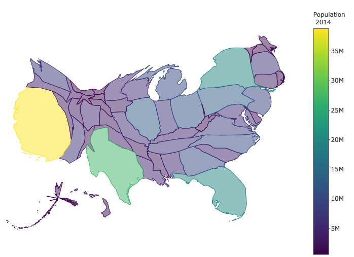
Sometimes, we may want to use custom maps to represent spatial information. For example, if we want to visualize the area of US states, the previous US maps are fine. If we want to represent the population size (Example 3), we may want to use a map such that the displayed area is proportional to the population size but not the geographical area. These types of custom maps need special tools to construct. Show you an exam without providing code to make the map.
Example 4 US population by states.
11.5 Mapview Maps
Every
mapviewmap loads several background maps and has a lot of advanced rendering capabilities that can be used to view large data. Because of this reason, each interactivemapviewmap is a huge file in size. Since this eBook is hosted on GitHub which has a limitation on the size of the individual file (25MB), we will NOT include interactivemapviewmaps in this section. Instead, we will include some screenshots to show whatmapviewmaps look like. You can run the code on a local machine to view the interactivity of these maps.
mapview provides functions to very quickly and conveniently create interactive visualizations of spatial data. Its main goal is to fill the gap of quick (not presentation grade) interactive plotting to examine and visually investigate both aspects of spatial data, the geometries, and their attributes.
It can also be considered a data-driven application programming interface (API) for the leaflet package as it will automatically render correct map types, depending on the type of the data (points, lines, polygons, raster).
In addition, it makes use of some advanced rendering functionality that will enable the viewing of much larger data than is possible with leaflet.
mapview() - view (multiple) spatial objects on a set of background maps
viewExtent() - view extent / bounding box of spatial objects
viewRGB() - view RGB true- or false-color images of raster objects
mapshot() - easily save maps (including leaflet maps) as HTML and/or
png (or other image formats).
mapview() function can work for a quick view of the data, providing choropleths, background maps, and attribute popups. Performance varies on the object and customization can be tricky.
In this note, we will use three data sets to illustrate how to make maps with mapview(): state population, state population (50 state), and state capitals.
11.5.1 1. Choropleth Map with mapview
library(tigris)
library(mapview)
library(dplyr)
library(sf)
#invisible({capture.output({
## Download shapefile for all states into R in tigris
## states() is a function in library {tigris}
us_geo <- states(cb = F, resolution = '20m')
#})
#})## caution: need to tell R that GEOIS should be a character variable since
## the same GEOID is character variable in the shape file us_geo with
## some leading zeros!
pop_data <- read.csv("https://raw.githubusercontent.com/pengdsci/sta553/main/data/state_population_data.csv", colClasses = c(GEOID = "character"))
## merger two data use the primary key: GEOID.
all_data <- inner_join(us_geo, pop_data, by = c("GEOID" = "GEOID"))
##
mapview(all_data, zcol = "PctChange10_20")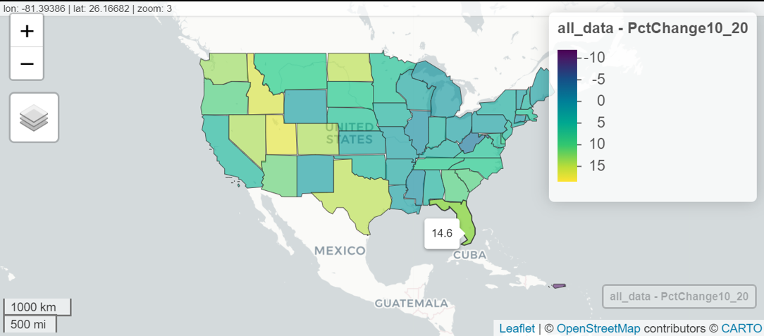
We can see some of the unique features of mapview:
The default
mapview()is created with one small line of code.mapview()Choose defaults based on the type of geospatial file. codemapview(all_data, zcol = "PctChange10_20")The default popup includes every field in my data that is useful to explore the data.
There are unwanted features in the above default choropleth map that need to be improved. For example, too much information in the hover text, lengthy legend title, etc. We will revisit this map and enhance the choropleth map.
11.5.2 2. Scatter Map with mapview
We now use state capital with longitude and latitude and plot the capital of each state. The idea is similar to that of ggplot: we make the scatter plots on the existing choropleth map using the geocode in the new sf object defined based on the new data set.
library(tigris)
library(mapview)
library(sf)
## load the location data
capitals <- read.csv("https://raw.githubusercontent.com/pengdsci/sta553/main/data/us-state-capitals.csv")
##
capitals_geo <- st_as_sf(capitals,
coords = c("longitude", "latitude"),
crs = 4326)
## we add the above layer to the previously created map
mapview(all_data, zcol = "PctChange10_20", layer.name = "Per Chg") + capitals_geo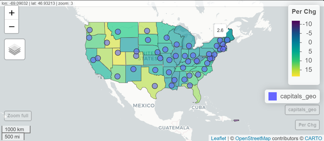
11.5.3 3. Scatter Map Without Using sf Object
We can also use mapview() to make a scatter plot directly on the basemap without using a choropleth map as the background. This simply uses the data with longitude and latitude to make the scatter map without converting the data to an `sf’ object.
The set to be used is a regular R data frame with longitude and latitude. Two new variables were added to the merged data set to make more information geographic representation of the change to the population from 2010 to 2020.
library(mapview)
pop_data <- read.csv("https://raw.githubusercontent.com/pengdsci/sta553/main/data/state_population_data.csv", colClasses = c(GEOID = "character"))
capitals <- read.csv("https://raw.githubusercontent.com/pengdsci/sta553/main/data/us-state-capitals.csv")
## inner join the above two data frames
state.pop.geo <- inner_join(pop_data, capitals, by = "State")
state.pop.geo$chg.size <- abs(state.pop.geo$PctChange10_20)
chg.dir <- rep("increase", dim(state.pop.geo)[1])
chg.dir[which(state.pop.geo$PctChange10_20 < 0)] = "decrease"
state.pop.geo$chg.dir = chg.dir
#
mapview(state.pop.geo, xcol = "longitude", ycol = "latitude",
crs = 4269,
grid = FALSE,
na.col ="red",
zcol = "chg.dir",
cex = "chg.size",
popup = TRUE,
legend = TRUE)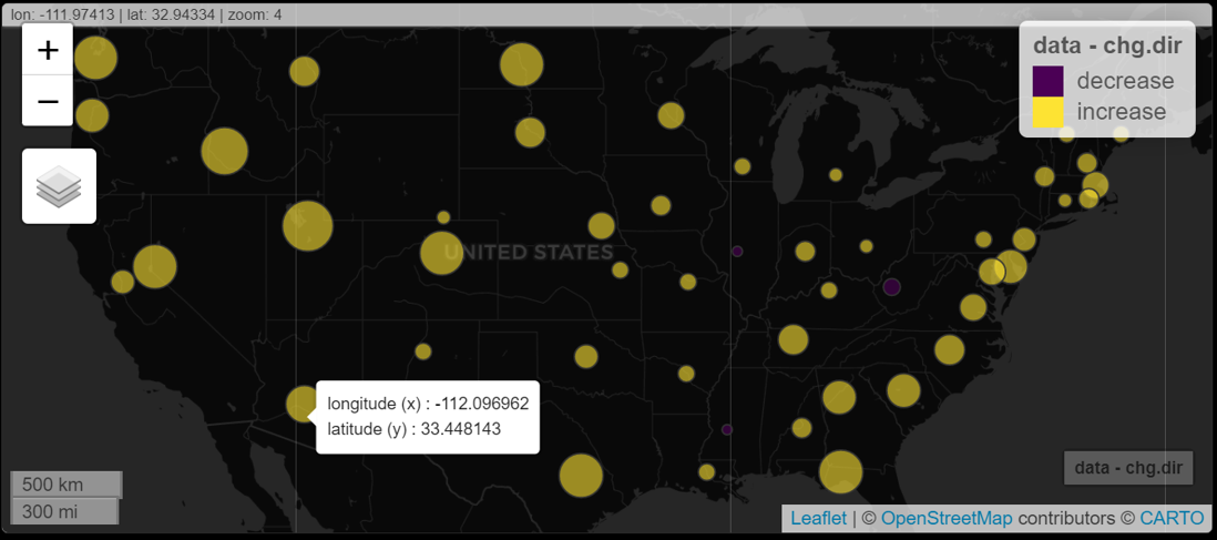
11.5.4 4. Customizing Default Maps
The following custom map enhances the default map from several perspectives.
We can customize map options such as color for polygon boundary lines and
col.regionsto fill the polygon Colors andalpha.regionsfor transparency.We can rename a layer with the extension
layer.nameif we want a more user-friendly layer name which will appear in the legend, the bottom right button, and when you open the layer button toward the top left.The default popup table contains the complete record. In practice, we only want to display a partial list of variables.
We set the center for viewing the map and the level of zoom.
library(tigris)
library(mapview)
library(leafpop)
library(sf)
CustomMap <- mapview(all_data,
## popup option allows to select variables to be displayed in the popup.
## by default, it shows all variables in the data set.
popup = popupTable(all_data,
zcol = c("State",
"Pop2010",
"Pop2020",
"PctChange10_20")),
zcol = "PctChange10_20",
layer.name = "Per Chg",
col.regions = brewer.pal(11,"RdYlGn"),
alpha.regions = 0.6)
##
CustomMap@map %>% setView(-98.35, 39.50, zoom = 4)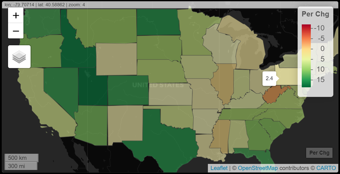
11.5.5 5. Mapview Options
It is not straightforward to add features to the map directly via mapview(). However, MapviewOption() can be used to add some new features or modify some existing features on the map. The following example shows some modifications.
library(mapview)
library(leafpop)
library(sf)
mapviewOptions(basemaps = c("Esri.WorldShadedRelief",
"OpenStreetMap.DE",
"CartoDB.Positron",
"CartoDB.DarkMatter",
"OpenTopoMap"),
raster.palette = grey.colors,
na.color = "magenta",
legend.pos = "bottomright",
layers.control.pos = "topright")
##
mapview(all_data,
zcol = "PctChange10_20",
layer.name = "Per Chg",
col.regions = brewer.pal(11, "RdYlGn"),
alpha.regions = 0.6)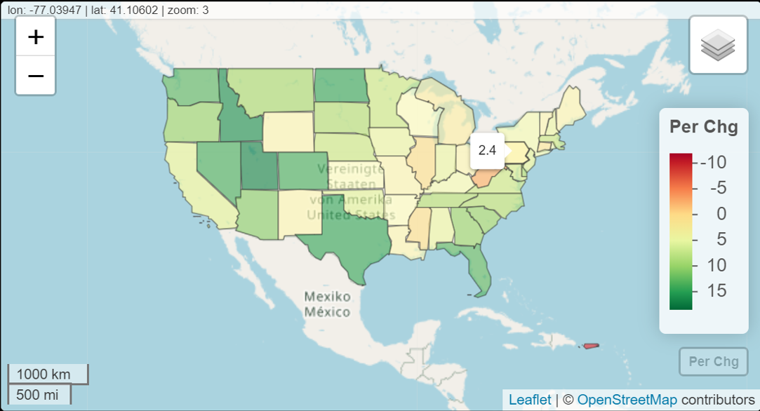
11.5.6 6. More Enhancements of Mapview (Leaflet)
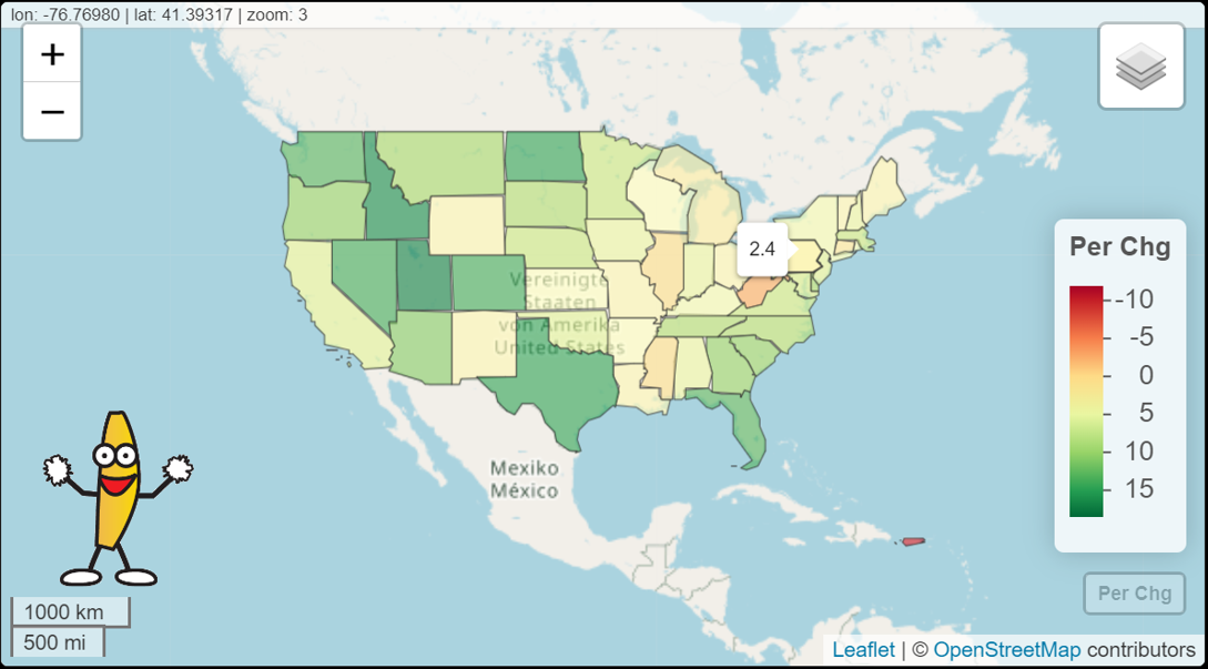
We can enhance mapview by adding more features to the existing mapview. In the following, we will add a few new features to the one created earlier. Add an image (WCU logo and gif) to the map.
Example 1: Adding a gif image to the map.
library(mapview)
library(leafpop)
library(sf)
library(leafem)
CustomMap <- mapview(all_data,
popup = popupTable(all_data,
zcol = c("State",
"Pop2010",
"Pop2020",
"PctChange10_20")),
zcol = "PctChange10_20",
layer.name = "Per Chg",
col.regions = brewer.pal(11,"RdYlGn"),
alpha.regions = 0.6)
## adding .gif image to the map.
leafem::addLogo(CustomMap, "https://github.com/pengdsci/sta553/raw/main/image/banana.gif",
position = "bottomleft",
offset.x = 5,
offset.y = 40,
width = 100,
height = 100)
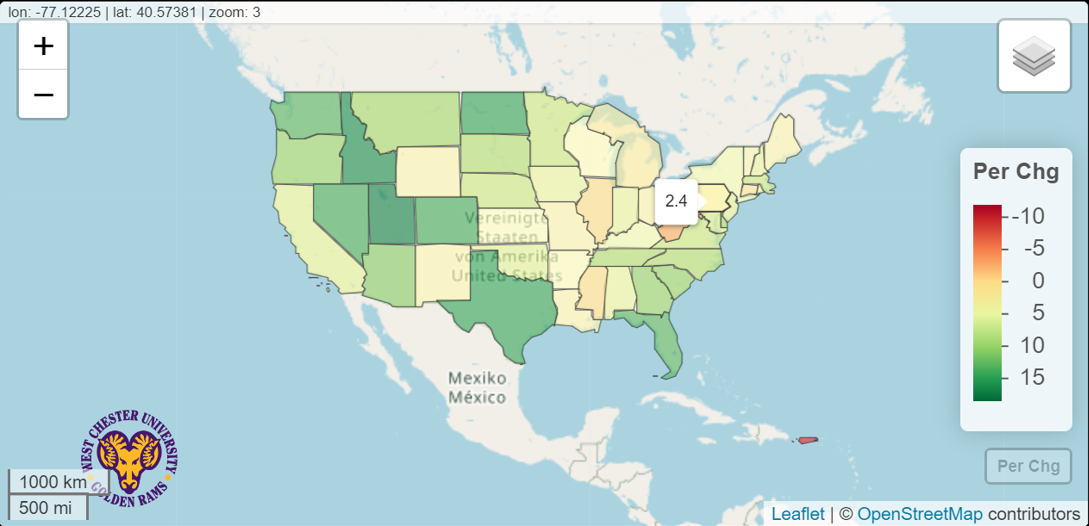
Example 2: Adding an image to the map.
We add the WCU logo to the map.
library(mapview)
library(leafpop)
library(sf)
library(leafem)
##
img <- "https://github.com/pengdsci/sta553/raw/main/image/goldenRamLogo.png"
##
CustomMap <- mapview(all_data,
popup = popupTable(all_data,
zcol = c("State",
"Pop2010",
"Pop2020",
"PctChange10_20")),
zcol = "PctChange10_20",
layer.name = "Per Chg",
col.regions = brewer.pal(11,"RdYlGn"),
alpha.regions = 0.6)
###
CustomMap %>% leafem::addLogo(img, url = "https://github.com/pengdsci/sta553/raw/main/image/goldenRamLogo.png", position = "bottomleft")
###
11.6 Thematic Maps
The tmap package is a relatively new way to plot thematic maps in R. Thematic maps are geographical maps in which spatial data distributions are visualized. This package offers a flexible and layer-based approach to creating thematic maps, such as choropleths and bubble maps. The syntax for creating plots is similar to that of ggplot2.
tmap_mode() will be used to determine the interactivity of the map: tmap_mode("plot") produces static maps and tmap_mode("view") produces interactive maps.
11.6.1 1. Choropleth Maps
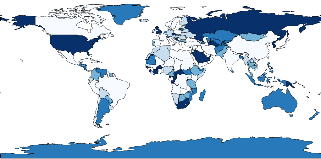
We will use a built-in world shapefile, World, that contains information about population, gdp, life expectancy, income, happiness index, etc.
Both choropleths and scatter maps will be illustrated using the built-in data.
Example 1: Choropleths: The default world map with the distribution of mean life expectancy among all countries. The default tmap_mode is set to be plot. The default tmap map is static.
Example 2: Interactive Map: use the above static map as the base map and add interactive features to the maps. The mode can be set with the function tmap_mode(), and toggling between the modes can be done with the ‘switch’ ttm() (which stands for toggle thematic map.
library(tmap)
#
tmap_mode("view") # "view" gives interactive map; "plot" gives static map.
##
## tmap_style set to "classic"
tmap_style("classic")
## other available styles are: "white", "gray", "natural",
## "cobalt", "col_blind", "albatross", "beaver", "bw", "watercolor"
tmap_options(bg.color = "skyblue",
legend.text.color = "white")
##
tm_shape(World) +
tm_polygons("life_exp",
legend.title = "Life Expectancy") +
tm_layout(bg.color = "gray",
inner.margins = c(0, .02, .02, .02)) 11.6.2 Mixed Maps (Multilayer)
Through a multilayer map, we can make a choropleth and place another on top of it. In the following example, we add one additional layer using the metro shapefile and plot the center of the metro area to get a scatter map.
Example 3: Mixed Map: two-layer mixes maps
library(tmap)
#*
data(metro)
##
tmap_mode("view") # "view" gives interactive map;
#tmap_style("classic") ## tmap_style set to "classic"
## other available styles are: "white", "gray", "natural",
## "cobalt", "col_blind", "albatross", "beaver", "bw", "watercolor"
tmap_options(bg.color = "skyblue",
legend.text.color = "white")
##
tm_shape(World) +
tm_polygons("life_exp",
legend.title = "Life Expectancy") +
tm_layout(bg.color = "gray",
inner.margins = c(0, .02, .02, .02)) +
tm_shape(metro) +
tm_symbols(col = "purple",
size = "pop2020",
scale = .5,
alpha = 0.5,
popup.vars=c("pop1950", "pop1960", "pop1980","pop1990", "pop2000","pop2010","pop2020")) library(spData)
library(sf)
library(mapview)
gj = "https://github.com/azavea/geo-data/raw/master/Neighborhoods_Philadelphia/Neighborhoods_Philadelphia.geojson"
##
gjsf = st_read(gj)## Reading layer `Neighborhoods_Philadelphia' from data source
## `https://github.com/azavea/geo-data/raw/master/Neighborhoods_Philadelphia/Neighborhoods_Philadelphia.geojson'
## using driver `GeoJSON'
## Simple feature collection with 158 features and 8 fields
## Geometry type: MULTIPOLYGON
## Dimension: XY
## Bounding box: xmin: -75.28027 ymin: 39.867 xmax: -74.95576 ymax: 40.13799
## Geodetic CRS: WGS 8411.6.3 Scatter Maps With geoCoordinates
We use the real estate data set to make a scatter map using the library tmap. We first need to define an sf object using st_as_sf() that shapefile with an individual point based on the longitude and latitude in the data set.
library(tmap)
library(sf)
realestate0 <- read.csv("https://raw.githubusercontent.com/pengdsci/sta553/main/map/Realestate.csv", header = TRUE)
realest <- realestate0[, -1]
## Create a shapefile with POINT type.
realest <-st_as_sf(realest, coords=c("Longitude","Latitude"), crs = 4326)
###
tm_shape(realest) +
tm_dots(col = "purple",
size = "Distance2MRT",
alpha = 0.5,
popup.vars=c("HouseAge", "PriceUnitArea", "NumConvenStores"),
shapes = c(1, 0)) 11.7 Tableau Maps
We create a choropleth map and a scatter map respectively in this note. Before creating maps, we first look to understand the structure of Tableau’s sheet.
We can see that each Tableau book has several components:
A - Workbook name - A workbook contains sheets. A sheet can be a worksheet, a dashboard, or a story.
B - Cards and shelves - Drag fields to the cards and shelves in the work space to add data to your view.
C - Toolbar - Use the toolbar to access commands and analysis and navigation tools.
D - View - This is the canvas in the work space where you create a visualization (also referred to as a “viz”).
E - Start page icon - Click this icon to go to the Start page, where you can connect to data. For more information, see Start Page.
F - Side Bar - In a worksheet, the sidebar area contains two tabs: the Data pane and the Analytics pane.
G - Data Source - Click this tab to go to the Data Source page and view your data.
H - Status bar - Displays information about the current view.
I - Sheet tabs - Tabs represent each sheet in your workbook. This can include worksheets, dashboards, and stories. You can rename and add more of these sheets, dashboards, and stories if needed.
Show Me - Click this toggle to select 24 built-in charts and the information needed to create these charts.
11.7.1 Choropleth Map
The data set we use for a choropleth map can be downloaded from https://raw.githubusercontent.com/pengdsci/sta553/main/data/USStatesFacts.csv.
You need to download and save this data file in a folder and then connect it to Tableau Public (or Tableau Online).
The following are steps for making a choropleth map:
Load the .csv file to Tableau (Public);
Click
sheet1in the bottom left taskbar;Drag variable
State(on the left navigation panel under the table) to the main drop field (Tableau considersStateas a geo-variable); at the same time, the two generatedLongitude(generated)andLatitude(generated)appear in the column and row fields automatically.Click the
Show Me(on the right side of a tiny color bar chart) in the top right of the screen;You will see a list of graphs. Click the middle
world mapin the second row, you will see an initial choropleth map.Click
Show Meagain to close the popup. We can click the legend on the top-right color to change the color of the map (if you like).To add more information to the hover text, you drag the variables on the list to the small icon labeled with
Detail.Click
Sheet 1to change it to a meaningful title.Finally we label the states by their abbreviations. To do this, drag
StatetoLabelin theMarkstable (next toDetail).You can edit the hover text by clicking
Tooltip.
The resulting map can be viewed on the Tableau Public Server at https://public.tableau.com/app/profile/cpeng/viz/US-States-Facts/Sheet1
11.7.2 Scatter Map
We use housing price data with the longitude and latitude associated with each property. The data set is at https://raw.githubusercontent.com/pengdsci/sta553/main/map/Realestate.csv
As we did in the previous example, we downloaded the data set and saved it in a folder.
The following are steps to create a scatter map.
Open the Tableau and connect the data source to Tableau.
After the data has been loaded to Tableau, click
Sheet1, you will see the list of variables on the left panel.Click
Latitude->Geographic Role->Latitude; do the same thing toLongitude.Drag
Latitudeto theColumnsfield andLongitudeto theRowsfield. You will see a single point inSheet 1. The two variables were automatically renamed asAVG(Latitude)andAVG(Longitude).Click
AVG(Latitude)and selectdimension, you will see a line plot inSheet 1. Do the same thing toAVG(Longitude). Now you see a scatter plot.Click
Show Me(top-right corner ofBook 1) and select the left-hand side map icon (the first one in the second row), you will see an initial scatter map.We want to use the size of the point to reflect the unit price. We drag
PriceUnitAreatoSizecard in theMarksshelf.Click
Show Meto close the chart menu. ClickSUM(Price Unit Area)(top-right corner) to change the point size.I drag
Transaction Yearto theColorcard to reflect the transaction year. We should choose a divergent color scale.Drag variables to the
Detailcard to be shown in the hover text.Since many unit prices are close to each other, there are overlapped points. So we want to change the level of opacity. To do this, click
Colorcard, choose the appropriate level of opacity, and edit the color to make a better map.Add a meaningful title.
Right click the map and select
Map Layersake the changes on the map background and layers.Other edits and modifications to improve the map.
The resulting map can be viewed on the Tableau Public Server at https://public.tableau.com/app/profile/cpeng/viz/RealEstateData_16469067466610/Sheet1
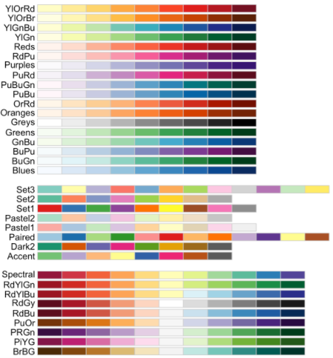
11.8 R Color Palettes
Since color coding is particularly important in map representation. We can use the following code to view various defined color scales (continuous and discrete) in the R library RColorBrewer.
* Sequential palettes are suited to ordered data that progress from low to high (gradient). The palettes names are: Blues, BuGn, BuPu, GnBu, Greens, Greys, Oranges, OrRd, PuBu, PuBuGn, PuRd, Purples, RdPu, Reds, YlGn, YlGnBu, YlOrBr, YlOrRd.
Qualitative palettes are best suited to represent nominal or categorical data. They do not imply magnitude differences between groups. The palette names are:
Accent,Dark2,Paired,Pastel1,Pastel2,Set1,Set2,Set3.Diverging palettes put equal emphasis on mid-range critical values and extremes at both ends of the data range. The diverging palettes are:
BrBG,PiYG,PRGn,PuOr,RdBu,RdGy,RdYlBu,RdYlGn,Spectral.
11.8.3 3. Color Palette Codes
| maxcolors | category | colorblind | |
|---|---|---|---|
| BrBG | 11 | div | TRUE |
| PiYG | 11 | div | TRUE |
| PRGn | 11 | div | TRUE |
| PuOr | 11 | div | TRUE |
| RdBu | 11 | div | TRUE |
| RdGy | 11 | div | FALSE |
| RdYlBu | 11 | div | TRUE |
| RdYlGn | 11 | div | FALSE |
| Spectral | 11 | div | FALSE |
| Accent | 8 | qual | FALSE |
| Dark2 | 8 | qual | TRUE |
| Paired | 12 | qual | TRUE |
| Pastel1 | 9 | qual | FALSE |
| Pastel2 | 8 | qual | FALSE |
| Set1 | 9 | qual | FALSE |
| Set2 | 8 | qual | TRUE |
| Set3 | 12 | qual | FALSE |
| Blues | 9 | seq | TRUE |
| BuGn | 9 | seq | TRUE |
| BuPu | 9 | seq | TRUE |
| GnBu | 9 | seq | TRUE |
| Greens | 9 | seq | TRUE |
| Greys | 9 | seq | TRUE |
| Oranges | 9 | seq | TRUE |
| OrRd | 9 | seq | TRUE |
| PuBu | 9 | seq | TRUE |
| PuBuGn | 9 | seq | TRUE |
| PuRd | 9 | seq | TRUE |
| Purples | 9 | seq | TRUE |
| RdPu | 9 | seq | TRUE |
| Reds | 9 | seq | TRUE |
| YlGn | 9 | seq | TRUE |
| YlGnBu | 9 | seq | TRUE |
| YlOrBr | 9 | seq | TRUE |
| YlOrRd | 9 | seq | TRUE |
11.8.4 4. Functions for Selecting Specific Color Palettes
Two functions can be used to display a specific color palette or return the code of the palette.
display.brewer.pal(n, name)displays a singleRColorBrewerpalette by specifying its name.brewer.pal(n, name)returns the hexadecimal color code of the palette.
The two arguments:
n = Number of different colors in the palette, minimum 3, maximum depending on palette.
name= A palette name from the lists above. For example name = RdBu.
Example 1: Display the first 8 colors of palette Dark2.
# View a single RColorBrewer palette by specifying its name
display.brewer.pal(n = 8, name = 'Dark2')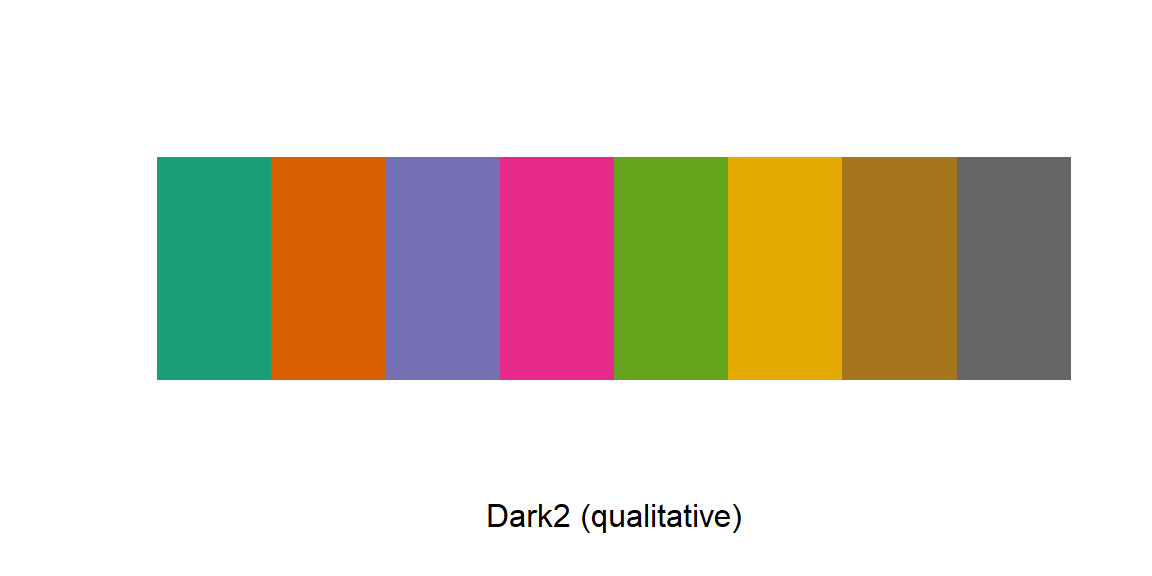
Example 2: Return the hexadecimal of the first 8 colors of palette Dark2.
| #1B9E77 | #D95F02 | #7570B3 | #E7298A | #66A61E | #E6AB02 | #A6761D | #666666 |
A. Functions Calling Specific rcolorbrewer Palette in ggplot()
The following color scale functions are available in ggplot2 for using the rcolorbrewer palettes:
scale_fill_brewer() for box plot, bar plot, violin plot, dot plot, etc.
scale_color_brewer() for lines and points
B. Functions Calling Specific rcolorbrewer Palette in Base Plots
The function brewer.pal() is used to generate a vector of colors.