Topic 14 Introduction to Tableau
The Hawks data set was collected by students from Cornell College. It is built in in the R library {Stat2Data}. I also made a copy and posted it at https://raw.githubusercontent.com/pengdsci/sta553/main/Tableau/hawks.csv. You can download it and save it to a folder on your machine.
data("Hawks")
write.csv(Hawks, file="/Users/chengpeng/WCU/Teaching/2022Spring/STA553/tableau/hawks.csv")
Tableau uses manual manual-driven approach to load data in certain formats. The following figure shows the types of external data that are connected to Tableau. There are some built-in data sets available in Tableau for practice purposes.
14.1 Data Loading
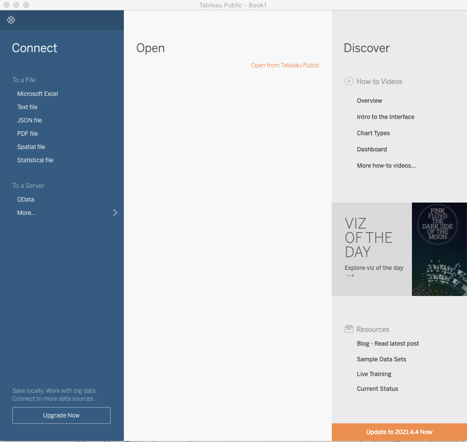
We open the program and see the following UI.
The Hawks data is in CSV format, we choose text file to connect to the data set. After the data is connected, we will see the following Data Source page with brief information on the data set.
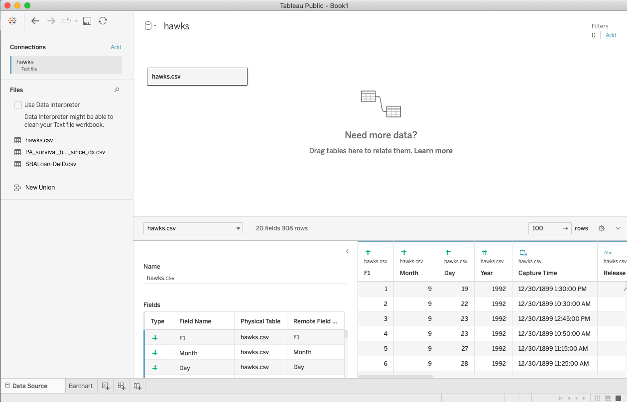
We can explore the variables in the data set on the data source page. We can connect to multiple data sets and merge them on this page.
14.2 Opening Work Sheet
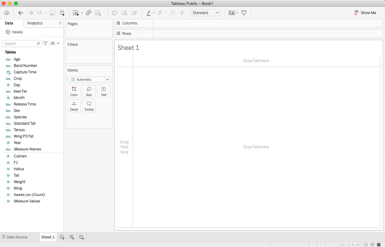
Click the Sheet Tab in the bottom left of the data source data, we will the list of the variables and the panels of visualization tools for making charts.
Statistical charts are created on different sheets. We can add more sheets as needed and change the default sheet name to a meaningful name.
Next, we create commonly used statistical charts in separate sheets.
14.3 Basic Statistical Charts with Existing Variables
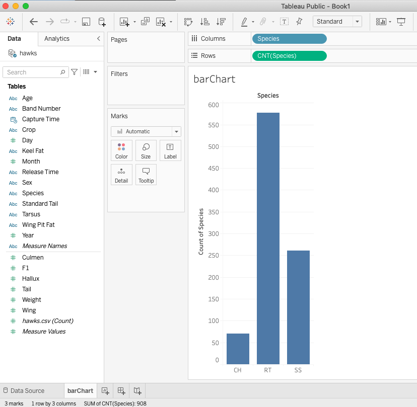
14.3.1 Bar Chart
Bar charts are one of the most common data visualizations. We can use them to quickly compare data across categories, highlight differences, show trends and outliers, and reveal historical highs and lows at a glance. Bar charts are especially effective when you have data that can be split into multiple categories.
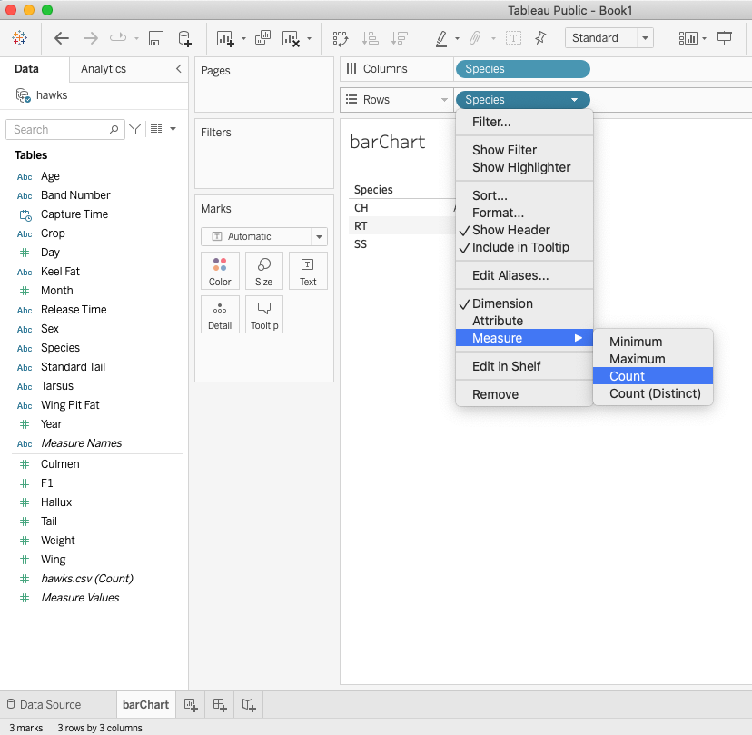
We consider the distribution of hawk species. Change Sheet 1 to barChart.
Step 1: Drag Species to the Column field
Step 2: Drag Species to the Row field and change it to counts (frequencies).
|
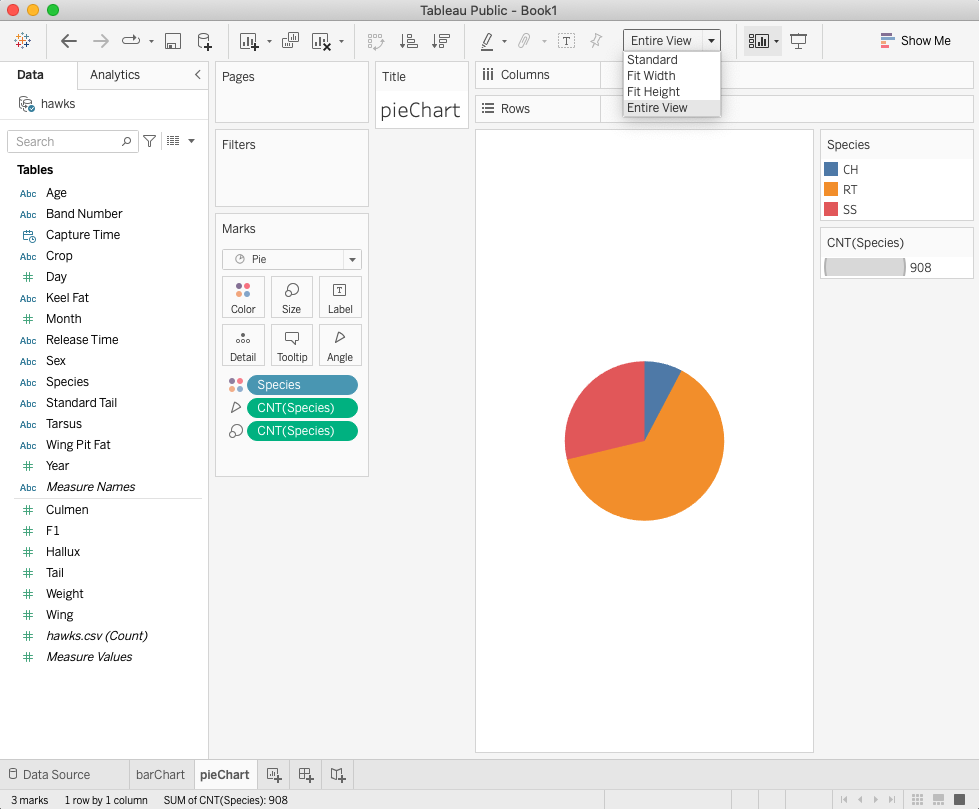
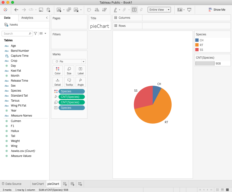
14.3.2 Pie Chart
Pie charts are powerful for adding detail to other visualizations. Alone, a pie chart doesn’t give the viewer a way to quickly and accurately compare information. Since the viewer has to create context on their own, key points from your data are missed. Instead of making a pie chart the focus of your dashboard, try using it to drill down on other visualizations.
Step 1: Repeat the two steps in bar chart.
Step 2: Click Show Me on the top-right of the UI and select piechart icon.
Step 3: Select the Entire View from the top panel drop-down menu.
Step 4: drag Species to Label in Marks panel.
|
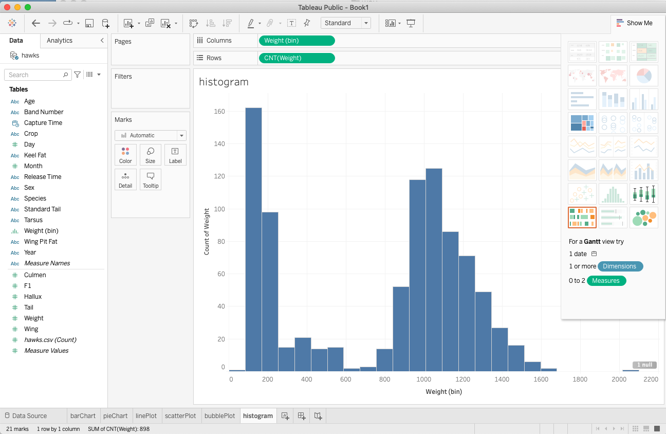
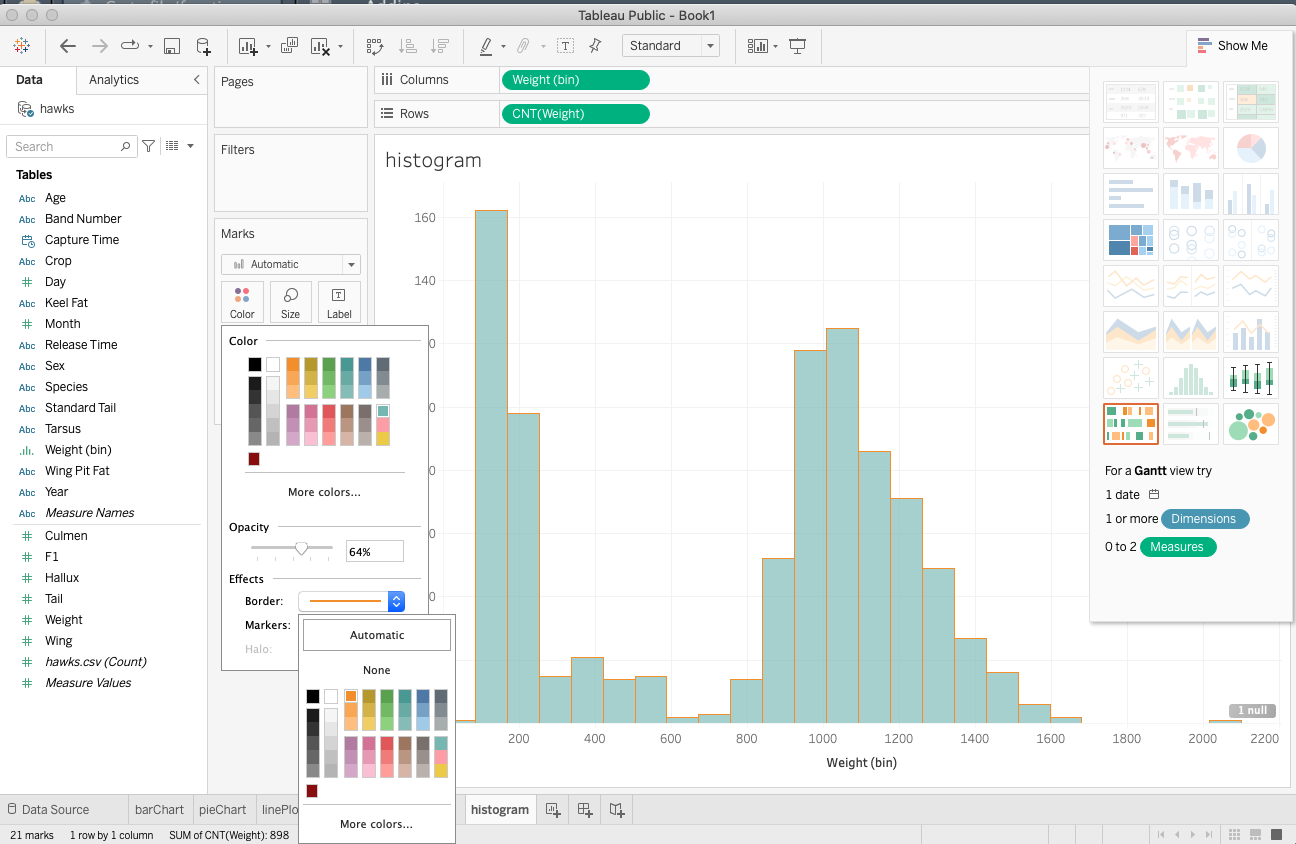
14.3.3 Histogram
A histogram is a chart that displays the shape of a distribution. A histogram looks like a bar chart but groups values for a continuous measure into ranges or bins.
Step 1: drag weight to the column field.
Step 2: Click show me, in the drop-down menu and select the histogram icon.
Step 3: Click the color icon in the Marks panel to adjust the color and border of the histogram.
|
|
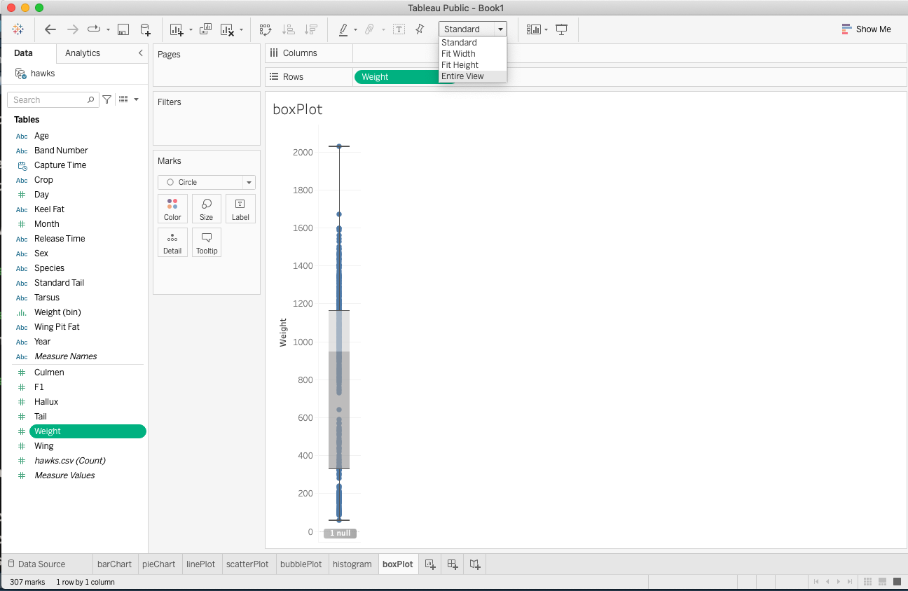
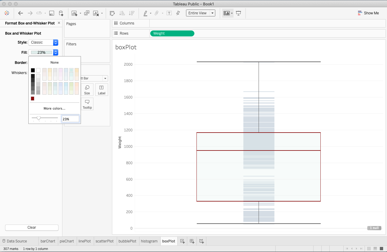
14.3.4 Box-plot
We can use box plots, also known as box-and-whisker plots, to show the distribution of values along an axis. Boxes indicate the middle 50 percent of the data (that is, the middle two quartiles of the data’s distribution).
The following steps are used to create a simple box plot.
Step 1: add a numerical variable to the sheet (we use weight in this example).
Step 2: change weight to dimension. It will automatically create a default box plot with data points plotted on the numerical axis.
Step 3: change the appearance of the box-plot by selecting Entire View (see the screenshot)
Step 4: choose Gantt Bar to show the density of the values and edit the boxplot to get a better chart.
|
|
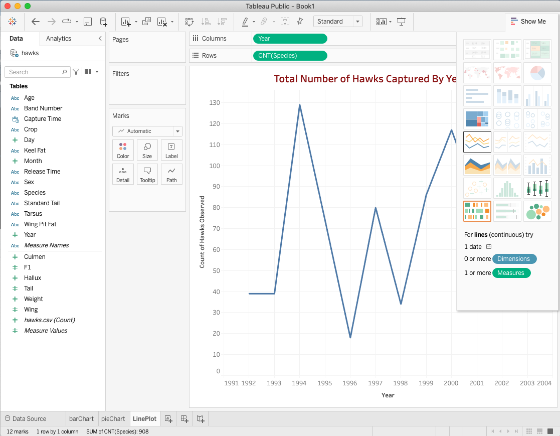
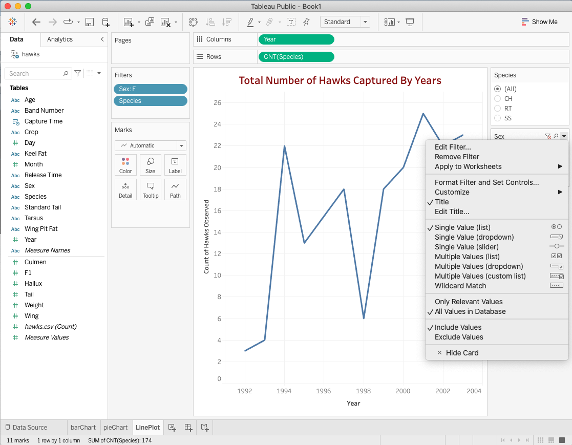
14.3.5 Line Chart
The line chart, or line graph, connects several distinct data points, presenting them as one continuous evolution. Use line charts to view trends in data, usually over time (like stock price changes over five years or website page views for the month). The result is a simple, straightforward way to visualize changes in one value relative to another.
Step 1: Drap year to the column field and Species to the row field and convert them into frequencies.
Step 2: Click Show Me on the top-right of the UI and select the line plot icon.
Step 3: Right-click Species and Sex and send them to the Filter panel.
Step 4: Choose an appropriate display form of the filter (see the right panel of the following screenshot)
|
|
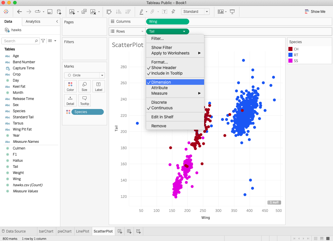
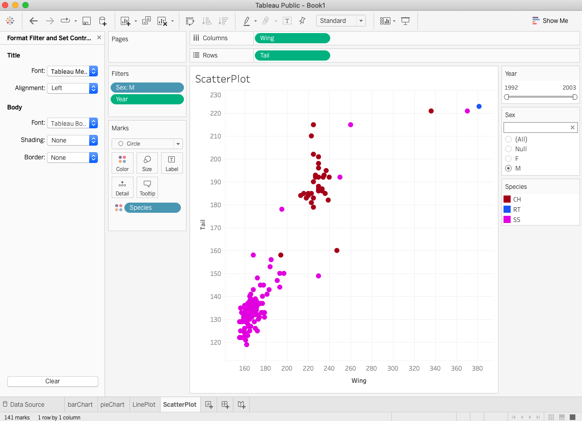
14.3.6 Scatter Plot
Scatter plots are an effective way to investigate the relationship between different variables, showing if one variable is a good predictor of another, or if they tend to change independently. A scatter plot presents lots of distinct data points on a single chart. The chart can then be enhanced with analytics like cluster analysis or trend lines.
Let’s explore the association between the lengths of wings and tails of hawks across the species. The following steps create a simple scatter plot in Tableau.
Step 1: Drag the two numerical variables to column and row fields.
Step 2: Change the two aggregated variables (by default) to dimension (see the left-hand side screenshot).
Step 3: Color code the species (drag species to the color mark).
Step 4: Choose the categorical variables to define filters to explore the association of a subset of the data (partial association) using a drop-down menu, radio button, slider, etc.
|
|
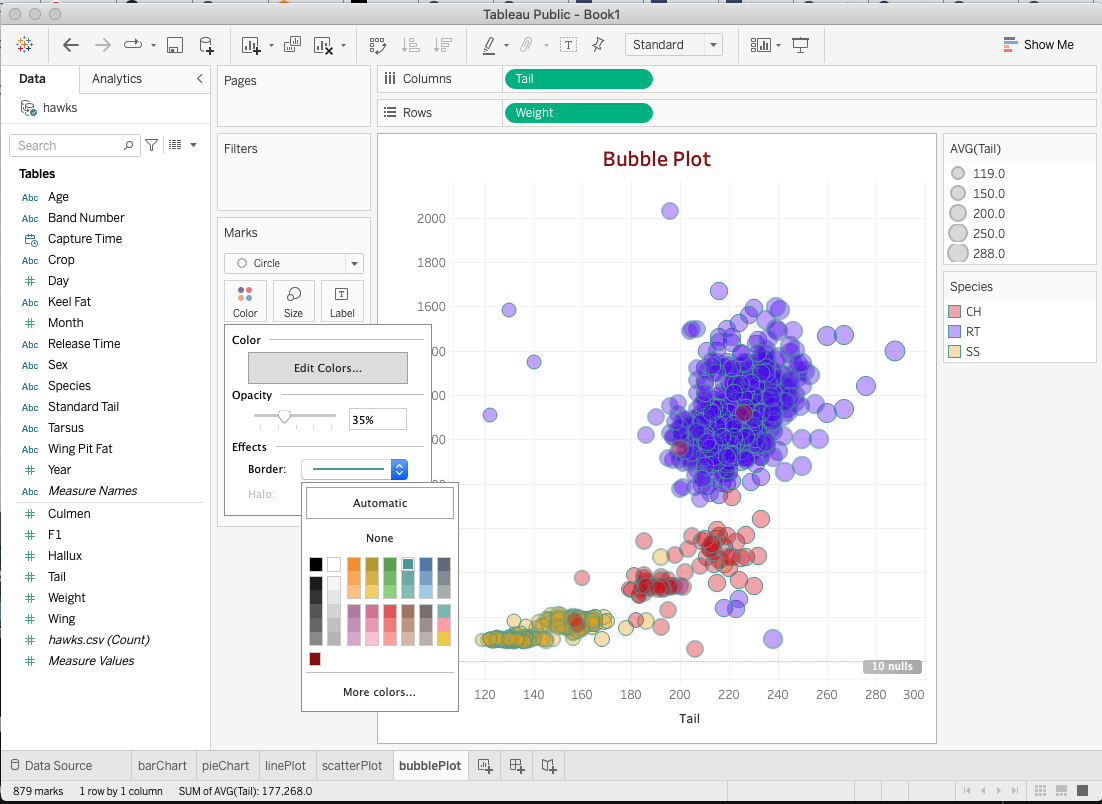
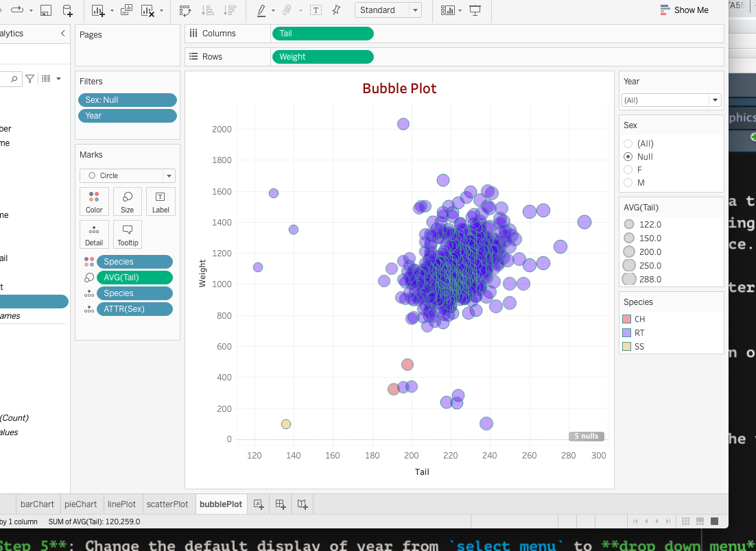
14.3.7 Bubble Chart
Although bubbles aren’t technically their own type of visualization, using them as a technique adds detail to scatter plots or maps to show the relationship between three or more measures. Varying the size and color of circles create visually compelling charts that present large volumes of data at once.
A bubble chart is modified from a regular scatter plot. We next use the above scatter plot as a base plot and make the point size proportional to the value of variable wing.
Step 1: create a basic scatter plot (following steps 1-4 in the previous section of the scatter plot).
Step 2: drag variable wing to size icon (Marks panel).
Step 3: right color icon in Marks panel to adjust transparency and modify the point border to make partially overlapped points distinguishable.
Step 4: convert year to a string variable and add sex and year to the filter.
Step 5: Change the default display of year from select menu to drop-down menu and sex to radio button
|
|
14.3.8 Treemap
Treemaps relate different segments of your data to the whole. As the name of the chart suggests, each rectangle in a treemap is subdivided into smaller rectangles, or sub-branches, based on its proportion to the whole. They make efficient use of space to show the percent total for each category.
14.3.9 Maps
Maps are a no-brainer for visualizing any kind of location information, whether it’s postal codes, state abbreviations, country names, or your own custom geocoding. If you have geographic information associated with your data, maps are a simple and compelling way to show how location correlates with trends in your data. Let’s look at a small data set with geo-information. The data set can be found at https://raw.githubusercontent.com/pengdsci/datasets/main/Realestate.csv. We first download this data and save it to a local folder so we can connect the data to Tableau.
The following steps will create a map to view the spatial distribution of properties in the Bay Area.
Step 1. Drag longitude and latitude to row and column fields respectively.
Step 2. Click Show me and select the World Map in the list of the template plots.
Step 3. Go to the top menu bar, and click Map to select a background map.
Step 4. Click the Color shelf in the Marks field, and change the default color to an appropriate color.
Step 5. Choose an appropriate color.
Step 6 Select an appropriate variable to determine the point size.
Step 7 Drag the variable you want to display in the hover text.
The following screenshot shows the above steps.
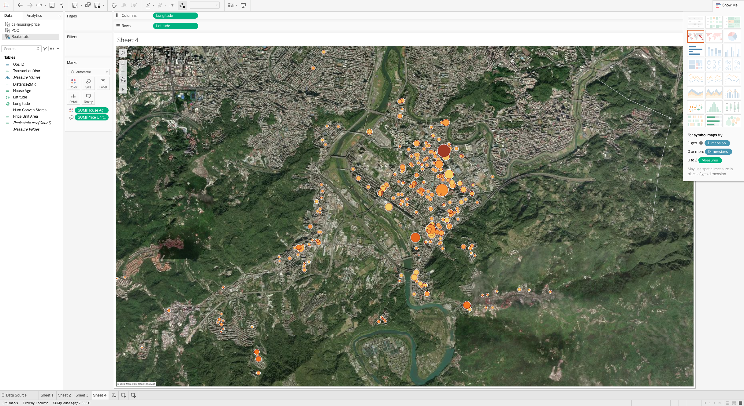
The actual map is available on the Tableau Public Server at https://public.tableau.com/app/profile/cpeng/viz/Book1_16487389941160/Sheet4?publish=yes
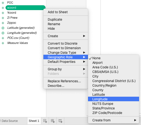
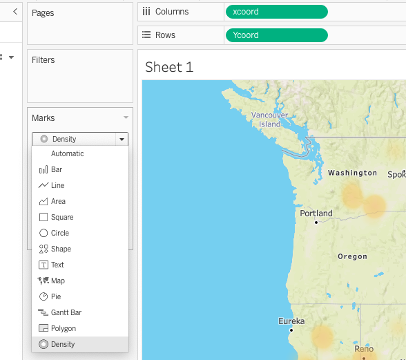
14.3.10 Density Maps
Density maps reveal patterns or relative concentrations that might otherwise be hidden due to an overlapping mark on a map—helping you identify locations with greater or fewer numbers of data points. Density maps are most effective when working with a data set containing many data points in a small geographic area.
Let’s use the POC (US gas station data) as an example of how to deal with many data points. The data can be found at: https://github.com/pengdsci/datasets/raw/main/POC.csv. We first download this data file save it into a local folder and then connect Tableau to this data.
The following suggested steps will create a density map for the US gas stations.
Step 1. Convert xcoord and ycoord to longitude and latitude (see the left screenshot below).
Step 2. Drag xcoord and ycoord to row and column fields respectively.
Step 3. In the drop-down menu of the Marks field, select density.
Step 4. Go to the top menu bar, and click Map to select a background map.
Step 5. Click the Color shelf in the Marks field, change the default color to an appropriate color.
|
|
14.4 Basic Charts with Derived Variables
Tableau has a lot of built-in functions that can be used to define derived variables. This section uses several examples to illustrate how to use some of the commonly used functions for creating statistical graphics. The complete list of these built-in functions can be found at https://help.tableau.com/current/pro/desktop/en-us/functions_all_alphabetical.htm
14.5 Tableau Dashboards
The data set is to be used in this case study. The visualization with be created using Tableau.
We first load the working data to R perform a simple exploratory data analysis and then decide what specific visualizations will be created.
The description of the data can be found at: https://github.com/pengdsci/sta553/raw/main/dash/mushroom-description.pdf
The data set can be found at: https://github.com/pengdsci/sta553/raw/main/dash/mushroom-data.csv
mushroom = read.csv("https://github.com/pengdsci/sta553/raw/main/dash/mushroom-data.csv")
names(mushroom)
## [1] "class" "cap.diameter" "cap.shape" "cap.surface"
## [5] "cap.color" "does.bruise.or.bleed" "gill.attachment" "gill.spacing"
## [9] "gill.color" "stem.height" "stem.width" "stem.root"
## [13] "stem.surface" "stem.color" "veil.type" "veil.color"
## [17] "has.ring" "ring.type" "spore.print.color" "habitat"
## [21] "season"Three numerical variables are summarized in the following.
##   cap.diameter     stem.height       stem.width
##  Min.   : 0.380   Min.   : 0.000   Min.   :  0.00
##  1st Qu.: 3.480   1st Qu.: 4.640   1st Qu.:  5.21
##  Median : 5.860   Median : 5.950   Median : 10.19
##  Mean   : 6.734   Mean   : 6.582   Mean   : 12.15
##  3rd Qu.: 8.540   3rd Qu.: 7.740   3rd Qu.: 16.57
## Max. :62.340 Max. :33.920 Max. :103.91## [1] "class" "cap.shape" "cap.surface" "cap.color"
## [5] "does.bruise.or.bleed" "gill.attachment" "gill.spacing" "gill.color"
## [9] "stem.root" "stem.surface" "stem.color" "veil.type"
## [13] "veil.color" "has.ring" "ring.type" "spore.print.color"
## [17] "habitat" "season"list(class = table(char.var$class),
cap.shape = table(char.var$cap.shape),
cap.surface = table(char.var$cap.surface),
cap.color = table(char.var$cap.color),
does.bruise.or.bleed = table(char.var$does.bruise.or.bleed),
gill.attachment = table(char.var$gill.attachment),
gill.spacing = table(char.var$gill.spacing),
gill.color = table(char.var$gill.color),
stem.root = table(char.var$stem.root),
stem.surface = table(char.var$stem.surface),
stem.color = table(char.var$stem.color),
veil.type = table(char.var$veil.type),
veil.color = table(char.var$veil.color),
has.ring = table(char.var$has.ring),
ring.type = table(char.var$ring.type),
spore.print.color = table(char.var$spore.print.color),
habitat = table(char.var$habitat),
season = table(char.var$season)
)## $class
##
## e p
## 27181 33888
##
## $cap.shape
##
## b c f o p s x
## 5694 1815 13404 3460 2598 7164 26934
##
## $cap.surface
##
## d e g h i k l s t w y
## 14120 4432 2584 4724 4974 2225 2303 1412 7608 8196 2150 6341
##
## $cap.color
##
## b e g k l n o p r u w y
## 1230 4035 4420 1279 828 24218 3656 1703 1782 1709 7666 8543
##
## $does.bruise.or.bleed
##
## f t
## 50479 10590
##
## $gill.attachment
##
## a d e f p s x
## 9884 12698 10247 5648 3530 6001 5648 7413
##
## $gill.spacing
##
## c d f
## 25063 24710 7766 3530
##
## $gill.color
##
## b e f g k n o p r u w y
## 954 1066 3530 4118 2375 9645 2909 5983 1399 1023 18521 9546
##
## $stem.root
##
## b c f r s
## 51538 3177 706 1059 1412 3177
##
## $stem.surface
##
## f g h i k s t y
## 38124 1059 1765 535 4396 1581 6025 2644 4940
##
## $stem.color
##
## b e f g k l n o p r u w y
## 173 2050 1059 2626 837 226 18063 2187 1025 542 1490 22926 7865
##
## $veil.type
##
## u
## 57892 3177
##
## $veil.color
##
## e k n u w y
## 53656 181 353 525 353 5474 527
##
## $has.ring
##
## f t
## 45890 15179
##
## $ring.type
##
## e f g l m p r z
## 2471 2435 48361 1240 1427 353 1265 1399 2118
##
## $spore.print.color
##
## g k n p r u w
## 54715 353 2118 1059 1259 171 182 1212
##
## $habitat
##
## d g h l m p u w
## 44209 7943 2001 3168 2920 360 115 353
##
## $season
##
## a s u w
## 30177 2727 22898 5267The above frequency table indicates that several categorical variables have a significantly high percentage of missing values. Since we only perform visual analytics to illustrate how to use Tableau to create dashboards, we will not perform any data management for modeling purposes.
14.5.1 Design Dashboards with Tableau
We briefly introduced the basic statistics charts using Tableau. In this note, we choose both categorical and quantitative variables in the working data set to construct individual charts with Tableau and then demonstrate how to use these charts to construct a dashboard with Tableau. We will not write detailed steps here since there are too many different ways to do the same thing.
14.6 Some Youtube Tutorials on Tableau
https://www.youtube.com/watch?v=GrT0wlQ2LZQ fancy pie charts
<https://public.tableau.com/views/US-States-Facts/Sheet1?:language=en-US&:display_count=n&:origin=viz_share_link
https://www.youtube.com/watch?v=iFGt6j7GZX0 density curve
https://www.youtube.com/watch?v=IIH19j_YG24 Excellent video!
https://www.youtube.com/watch?v=ZfpUzp8mBSw Donut chart
https://www.youtube.com/watch?v=gWZtNdMko1k&list=PLWPirh4EWFpGXTBu8ldLZGJCUeTMBpJFK 91-video tutorials