STA504 E-Pack: Mathematical Statistics with Calc. Rev.
West Chester University
Topic 1 Introduction
This E-Pack is a self-contained homegrown eBook that contains all topics covered in current STA504 at WCU.
All technical terms used in this eBook are consistent with those used in the required textbook. The key features of this eBook are
Each chapter (topic) has a section of Calculus review that covers the Calculus tools used in the associated chapters.
The mathematical derivations are more detailed. This is a way to review Calculus.
All statistical methods are originated from real-world applications. The eBook uses examples that either come from real-world for either illustration or motivation for learning certain concepts.
The companion course web page uses chapters of this eBook as weekly class notes. A small set of problems that reflect the contents in the relevant chapter is also provided on the course web page.
1.1 Use of Technologies
Although it is not required to use any software program in this class, you are still encouraged to use RMarkdown (for R users) or Jupyter Notebook (for Python users) to draft your assignments and practice basic graphical and computational capabilities of these software tools.
Both RMarkdown and Jupyter Notebook are very convenient to use in drafting technical documents that involves mathematical equations and graphics. To write mathematical formulas, you can use LaTex commands in Rmarkdown and Jupyter notebook.
1.1.1 Greek Letters
| Symbol | Script |
|---|---|
| \(\alpha\) | \alpha |
| \(A\) | A |
| \(\beta\) | \beta |
| \(B\) | B |
| \(\gamma\) | \gammma |
| \(\Gamma\) | \Gamma |
| \(\pi\) | \pi |
| \(\Pi\) | \Pi |
| \(\phi\) | \phi |
| \(\Phi\) | \Phi |
| \(\varphi\) | \varphi |
| \(\theta\) | \theta |
1.1.2 Operators
| Symbol | Script |
|---|---|
| \(\cos\) | \cos |
| \(\sin\) | \sin |
| \(\lim\) | \lim |
| \(\exp\) | \exp |
| \(\to\) | \to |
| \(\infty\) | \infty |
| \(\equiv\) | \equiv |
| \(\bmod\) | \bmod |
| \(\times\) | \times |
1.1.4 Fractions and Binomials
| Symbol | Script |
|---|---|
| \(\frac{n!}{k!(n-k)!}\) | \frac{n!}{k!(n-k)!} |
| \(\binom{n}{k}\) | \binom{n}{k} |
| \(\frac{\frac{x}{1}}{x - y}\) | \frac{\frac{x}{1}}{x - y} |
| \(^3/_7\) | ^3/_7 |
1.1.7 More Special Symbols
| Symbol | Script |
|---|---|
| \(a^{\prime}\) | a^{\prime} |
| \(a^{\prime\prime}\) | a^{\prime\prime} |
| \(\hat{a}\) | \hat{a} |
| \(\bar{a}\) | \bar{a} |
| \(\grave{a}\) | \grave{a} |
| \(\acute{a}\) | \acute{a} |
| \(\dot{a}\) | \dot{a} |
| \(\ddot{a}\) | \ddot{a} |
| \(\not{a}\) | \not{a} |
| \(\mathring{a}\) | \mathring{a} |
| \(\overrightarrow{AB}\) | \overrightarrow{AB} |
| \(\overleftarrow{AB}\) | \overleftarrow{AB} |
| \(a^{\prime\prime\prime}\) | a^{\prime\prime\prime} |
| \(\overline{aaa}\) | \overline{aaa} |
| \(\check{a}\) | \check{a} |
| \(\vec{a}\) | \vec{a} |
| \(\underline{a}\) | \underline{a} |
| \(\color{red}x\) | \color{red}x |
| \(\pm\) | \pm |
| \(\mp\) | \mp |
| \(\int y \mathrm{d}x\) | \int y \mathrm{d}x |
| \(,\) | , |
| \(:\) | : |
| \(;\) | ; |
| \(!\) | ! |
| \(\int y, \mathrm{d}x\) | \int y, \mathrm{d}x |
| \(\dots\) | \dots |
| \(\ldots\) | \ldots |
| \(\cdots\) | \cdots |
| \(\vdots\) | \vdots |
| \(\ddots\) | \ddots |
1.1.8 Brackets
| Symbol | Script |
|---|---|
| \((a)\) | (a) |
| \([a]\) | [a] |
| \(\{a\}\) | \{a\} |
| \(\langle f \rangle\) | \langle f \rangle |
| \(\lfloor f \rfloor\) | \lfloor f \rfloor |
| \(\lceil f \rceil\) | \lceil f \rceil |
| \(\ulcorner f \urcorner\) | \ulcorner f \urcorner |
1.1.9 Matrix
$$
X_{m,n} =
\begin{pmatrix}
  x_{1,1} & x_{1,2} & \cdots & x_{1,n} \\
  x_{2,1} & x_{2,2} & \cdots & x_{2,n} \\
  \vdots  & \vdots  & \ddots & \vdots  \\
  x_{m,1} & x_{m,2} & \cdots & x_{m,n}
\end{pmatrix}
$$
produces
\[ X_{m,n} = \begin{pmatrix} x_{1,1} & x_{1,2} & \cdots & x_{1,n} \\ x_{2,1} & x_{2,2} & \cdots & x_{2,n} \\ \vdots & \vdots & \ddots & \vdots \\ x_{m,1} & x_{m,2} & \cdots & x_{m,n} \end{pmatrix} \]
$$
M =
\begin{bmatrix}
\frac{5}{6} & \frac{1}{6} & 0 \\[0.3em]
\frac{5}{6} & 0 & \frac{1}{6} \\[0.3em]
0 & \frac{5}{6} & \frac{1}{6}
\end{bmatrix}
$$
produces
\[ M = \begin{bmatrix} \frac{5}{6} & \frac{1}{6} & 0 \\[0.3em] \frac{5}{6} & 0 & \frac{1}{6} \\[0.3em] 0 & \frac{5}{6} & \frac{1}{6} \end{bmatrix} \]
1.1.10 Aligned Equations
$$
\begin{aligned}
Bias(\hat{\theta})  &= E(\hat{\theta}) - \theta \\
Bias(\hat{\theta})  &= E(2 \bar{X} -1) - \theta \\
Bias(\hat{\theta})  &= \frac{2}{n}\sum_{i=1}^n E(X_i) -1 -\theta \\
Bias(\hat{\theta})  &= 2E(X) - 1 - \theta \\
Bias(\hat{\theta})  &= 2 \cdot \frac{\theta+1}{2} - 1 - \theta \\
Bias(\hat{\theta})  &= 0 \\
\end{aligned}
$$
Produces the following system of equations
\[ \begin{aligned} Bias(\hat{\theta}) &= E(\hat{\theta}) - \theta \\ Bias(\hat{\theta}) &= E(2 \bar{X} -1) - \theta \\ Bias(\hat{\theta}) &= \frac{2}{n}\sum_{i=1}^n E(X_i) -1 -\theta \\ Bias(\hat{\theta}) &= 2E(X) - 1 - \theta \\ Bias(\hat{\theta}) &= 2 \cdot \frac{\theta+1}{2} - 1 - \theta \\ Bias(\hat{\theta}) &= 0 \\ \end{aligned} \]
1.2 Including Images and Graphics
One can write code in either R (in RMarkdown code chunk) or Python (in Jupyter notebook cell) to produce graphics such as density curves or distribution histograms for different random variables. Sometimes, one can also include external (dynamic or static) images in the document.
Since both RMarkdown and Jupyter notebook support HTML syntax, we can use HTML image tag to include external images into the documet. In the mean while they also support LaTex () style commands, wecould also use LaTex command to include images to the document.
1.3 R plot() Function
Every programming language has its base plot functions to make graphics. We use base R plot() function as an example to show how to use it and related graphical functions to make high quality graphics in R.
For illustration, we use the standard normal distribution as an example to demonstrate how to make a nice graph to display important information. The probability density function of the standard normal density has the following form
\[ \phi(z) = \frac{1}{\sqrt{2}}e^{-z^2/2}, \mbox{ where } -\infty < z <\infty. \]
The x-coordinates to be used are: -3.0, -2.6, -2.2, -1.8, -1.4, -1.0, -0.6, -0.2, 0.2, 0.6, 1.0, 1.4, 1.8, 2.2, 2.6, 3.0. We can then use the above density function to calculate the corresponding y-coordinates. In R, we use the following code to define the coordinates of the above 16 points on the density curve.
x = c(-3.0,-2.6,-2.2,-1.8,-1.4,-1.0,-0.6,-0.2,0, 0.2,0.6,1.0,1.4,1.8, 2.2,2.6,3.0)
y = (1/sqrt(2))*exp(-x^2/2)
1.3.1 The plot() function
In R, the base graphics function to create a plot is the plot() function. It has many options and arguments to control many things, such as the plot type, labels, titles and colors. The plotting process is analogous to the hand drawing process: make a base plot and then add additional graphical components to make the graph more informative, understandable, and aesthetically pleasant.
The syntax of plot() is
plot(x,y,type,main,xlab,ylab,pch,col,las,bty,bg,cex,…)where the graphical arguments(parameters) are given by
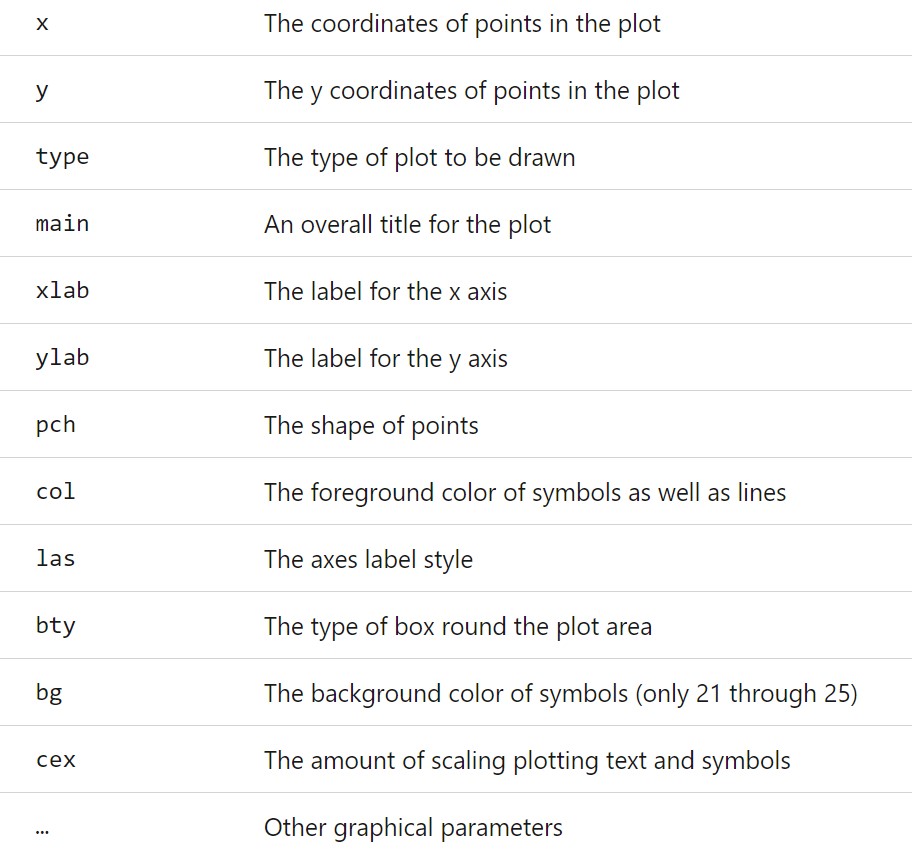
Figure 1.1: plot() arguments
The two coordinates must be paired (represent the location of the corresponding point), main is a string representing the name of the plot. xlab and ylab are also strings reflecting the labels of x- and y-axes.
The rest of the listed arguments have different choices. Next, we list the choices you can use to decorate your plot.
1.3.1.1 type: Plot Types
The argument type is a string argument. Different string value representing different types.
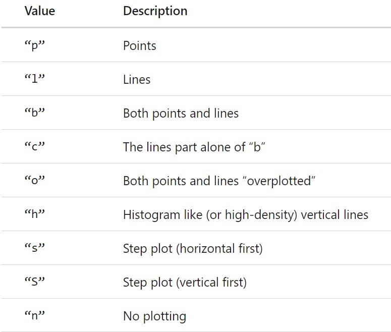
Figure 1.2: Types of plot in R
We plot the above normal density function in different types.
par(mfrow = c(3,3), mar=c(2, 2, 4, 0.5), oma = c(0.1, 0.1, 0.1, 0.1))
plot(x, y, type = "p", main = "type='p'", xlab = "", ylab="")
plot(x, y, type = "l", main = "type='l'", xlab = "", ylab="")
plot(x, y, type = "b", main = "type='b'", xlab = "", ylab="")
plot(x, y, type = "c", main = "type='c'", xlab = "", ylab="")
plot(x, y, type = "o", main = "type='o'", xlab = "", ylab="")
plot(x, y, type = "h", main = "type='h'", xlab = "", ylab="")
plot(x, y, type = "s", main = "type='s'", xlab = "", ylab="")
plot(x, y, type = "S", main = "type='S'", xlab = "", ylab="")
plot(x, y, type = "n", main = "type='n'", xlab = "", ylab="")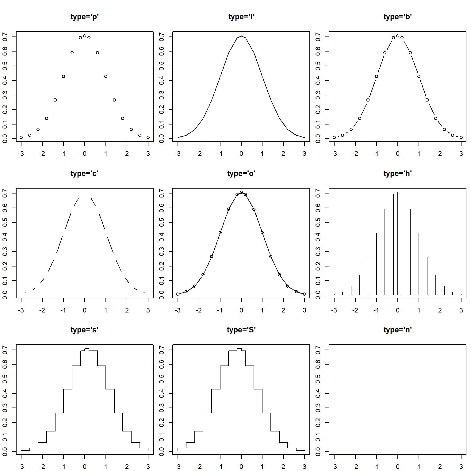
Figure 1.3: Different types of normal density function
1.3.1.2 pch: Point Shapes
The argument pch is point shape which takes a character value representing different shapes of the point you can choose for plot() function. Here is the table of possible point shape.
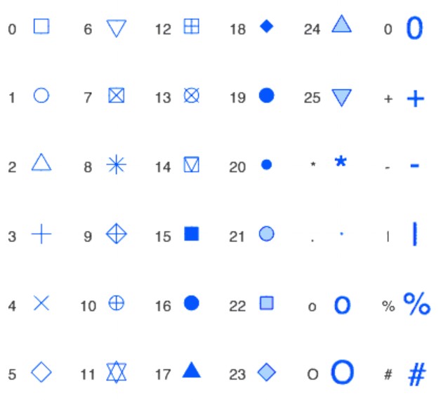
Figure 1.4: Point shapes in R
In the following figure, we choose a few different shapes to demonstrate the ways of choosing different point shapes.
par(mfrow = c(3,3), mar=c(2, 2, 4, 0.5), oma = c(0.1, 0.1, 0.1, 0.1))
plot(x, y, type = "b", pch = 1, main = "pch = 1", xlab = "", ylab="")
plot(x, y, type = "b", pch = 3, main = "pch = 3", xlab = "", ylab="")
plot(x, y, type = "b", pch = 5, main = "pch = 5", xlab = "", ylab="")
plot(x, y, type = "b", pch = 7, main = "pch = 7", xlab = "", ylab="")
plot(x, y, type = "b", pch = 9, main = "pch = 9", xlab = "", ylab="")
plot(x, y, type = "b", pch = 11, main = "pch = 11", xlab = "", ylab="")
plot(x, y, type = "b", pch = 13, main = "pch = 13", xlab = "", ylab="")
plot(x, y, type = "b", pch = 17, main = "pch = 17", xlab = "", ylab="")
plot(x, y, type = "b", pch = 21, main = "pch = 21", xlab = "", ylab="")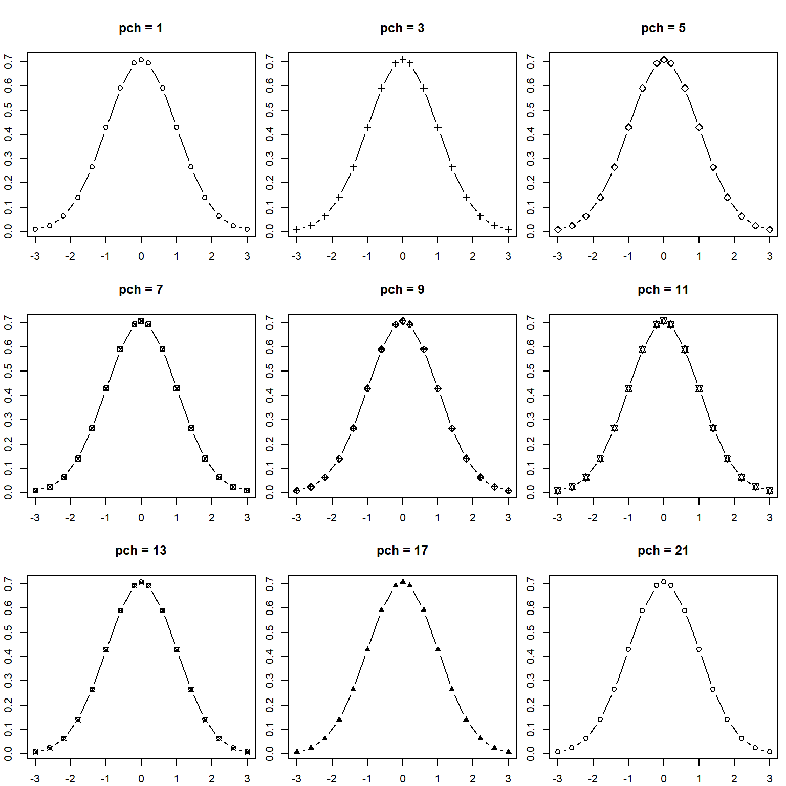
Figure 1.5: Different shapes in the plot of normal density function
1.3.1.3 las - Axis Label Style
Choosing different values for las changes the orientation angle of the labels. The following table lists the styles of axis labels.
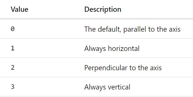
Figure 1.6: Axis label styles in R
The figure below shows different axis label styles.
par(mfrow = c(2,2), mar=c(4, 4, 4, 4), oma = c(0.1, 0.1, 0.1, 0.1))
plot(x, y, type = "b", main = "las = 0", las = 0, xlab = "x-values", ylab="y-values")
plot(x, y, type = "b", main = "las = 1", las = 1, xlab = "x-values", ylab="y-values")
plot(x, y, type = "b", main = "las = 2", las = 2, xlab = "x-values", ylab="y-values")
plot(x, y, type = "b", main = "las = 3", las = 3, xlab = "x-values", ylab="y-values")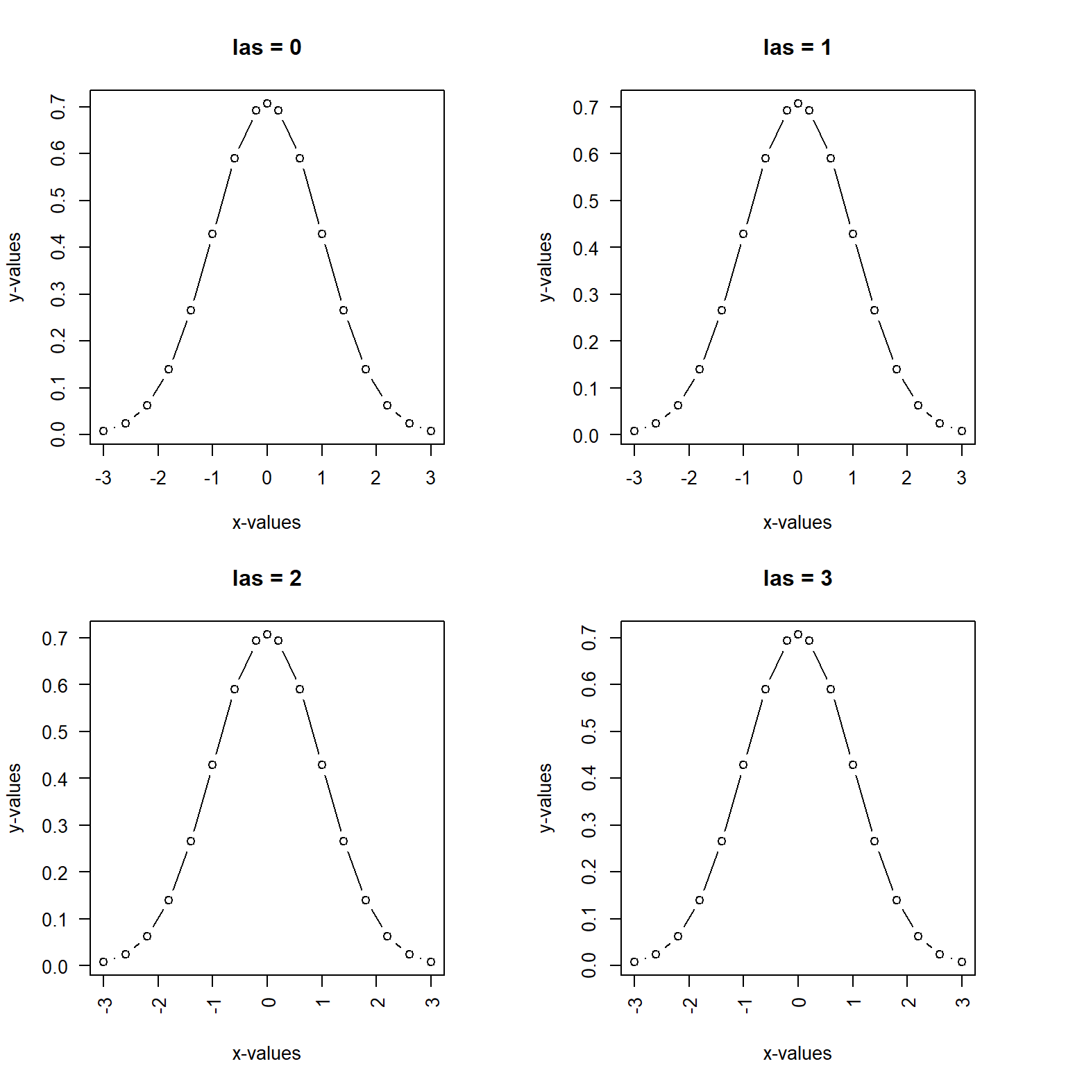
Figure 1.7: Different shapes in the plot of normal density function
1.3.1.4 R Colors
R has hundreds of different colors defined based the base colors:RGB. You can use this link to find the color code for your needs: https://rstudio-pubs-static.s3.amazonaws.com/3486_79191ad32cf74955b4502b8530aad627.html
When plotting, we can use col = colorCode to specify a color for the plot. For point shapes with code 21-25, you can choose different colors for the border and the background respectively.
The following are few example plots
par(mfrow = c(2,2), mar=c(4, 4, 4, 4), oma = c(0.1, 0.1, 0.1, 0.1))
plot(x, y, type = "l", main = "color code: 2",  col = 2,
     xlab = "x-values", ylab="y-values")
plot(x, y, type = "l", main = "color name: blue",    col = "blue",
     xlab = "x-values", ylab="y-values")
plot(x, y, type = "p", main = "color name: darkred", col = "darkred", pch= 22,
     bg = "yellow", xlab = "x-values", ylab="y-values")
plot(x, y, type = "p", main = "color code: 3",  col = 5, pch= 25,  bg = "red",
     xlab = "x-values", ylab="y-values")
Figure 1.8: Coloring border and background of points and coloring lines
1.3.1.5 cex - Character Expansion
We can re-scale the the point size of the plot in R. The default size is 1. If the value of cex is less than 1, then the size of the character will be reduced. If assigned value id greater than 1, the size character will be increased.
par(mfrow = c(1,2), mar=c(4, 4, 4, 4), oma = c(0.1, 0.1, 0.1, 0.1))
plot(x, y, type = "p", main = "border: darkred, bg: yellow", col = "darkred", pch= 21,
     bg = "yellow", cex = 1.8, xlab = "x-values", ylab="y-values")
plot(x, y, type = "p", main = "border: skyblue, bg: red",  col = "skyblue", pch= 23,
     bg = "red", cex = 0.8,  xlab = "x-values", ylab="y-values")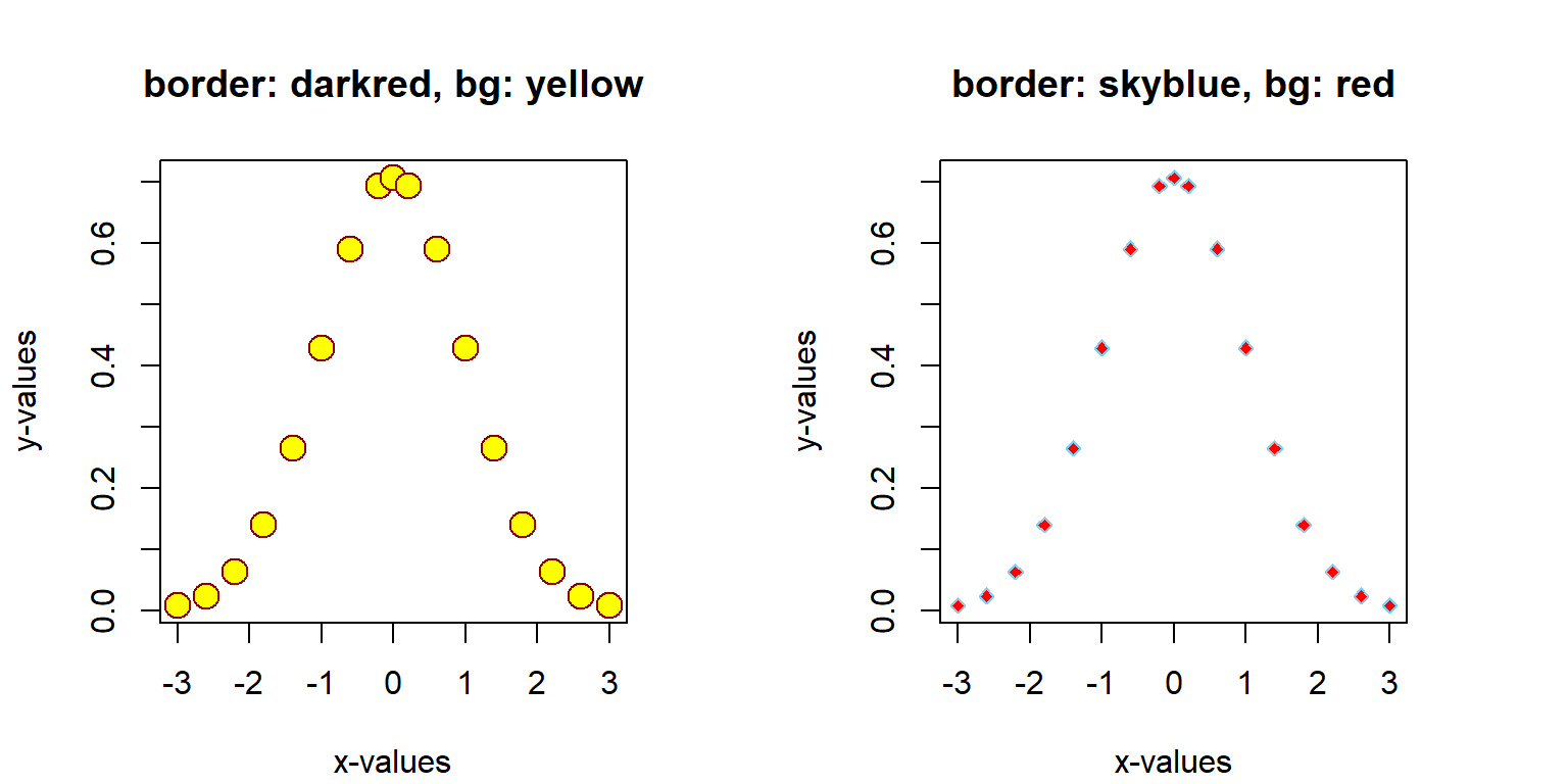
Figure 1.9: cex: re-size points
1.3.2 Adding Graphic Components to Base Plot
The above simple plots are made using the generic plot function plot(). We can use the arguments to choose plot types, point characters, colors, sizes, etc. Sometimes we may want to add additional graphic features using associated graphic functions to make the plot more informative and more aesthetically appealing to viewers.
1.3.2.1 Adding A Grid: grid()
par(mfrow = c(2,2), mar=c(4, 4, 4, 4), oma = c(0.1, 0.1, 0.1, 0.1))
plot(x, y, type = "l", main = "color code: 2",  col = 2,
     xlab = "x-values", ylab="y-values")
grid(5, 5, lty = 1, col = "red")


plot(x, y, type = "l", main = "color name: blue",    col = "blue",
     xlab = "x-values", ylab="y-values")
grid(10, 10, lty = 2, col = "blue")

plot(x, y, type = "p", main = "color name: darkred", col = "darkred", pch= 22,
     bg = "yellow", xlab = "x-values", ylab="y-values")
grid(15, 15, lty = 3, col = "purple")

plot(x, y, type = "p", main = "color code: 3",  col = 5, pch= 25,  bg = "red",
     xlab = "x-values", ylab="y-values")
grid(20, 20, lty = 4, col = "darkgreen")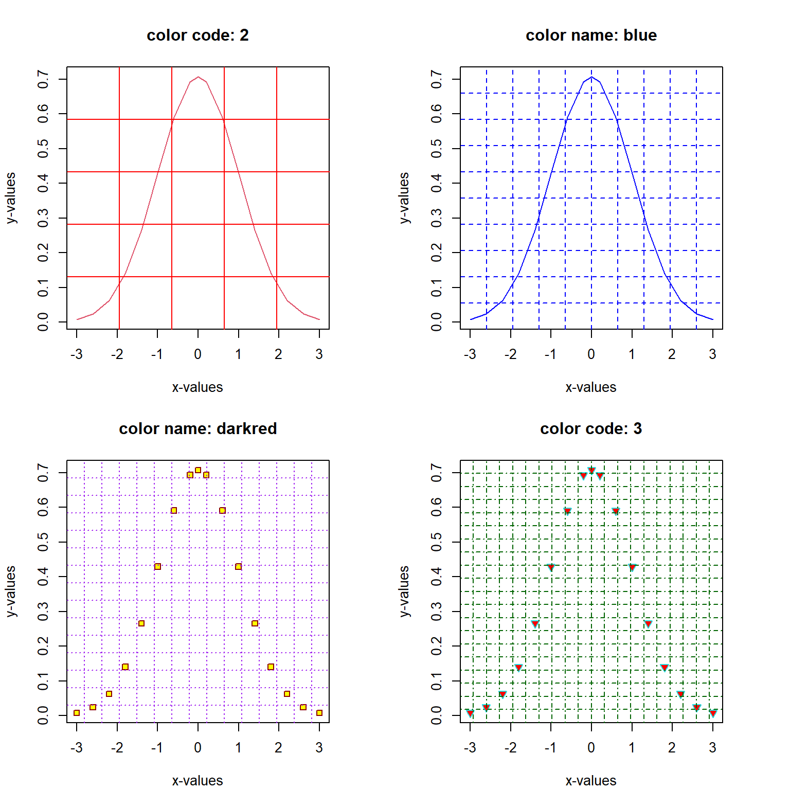
Figure 1.10: Adding a grid to existing plots
1.3.2.2 Add New Points and Lines
We can also use graphic function points() and lines() to add points and lines with different features discussed in the generic plot created using the generic plot() function. For example, we can find the point(s) that has (have) the biggest vertical coordinate and then make a line that passes through the origin and the top point(s).
max.id = which(y==max(y))
max.x = x[max.id]
max.y = y[max.id]
plot(x,y, type = "l", lty = 1, col = "navy", xlab = "", ylab = "",
     main = "Normal density curve: highest point(s)")
## adding points: the origin and the top point!
points(c(0,max.x), c(0,max.y), pch = 21, col = "red", bg = "yellow", cex = 2)
## Adding parallel line passing through the top point(s)
lines(c(0,max.x), c(0,max.y), lty = 2, col = "orange")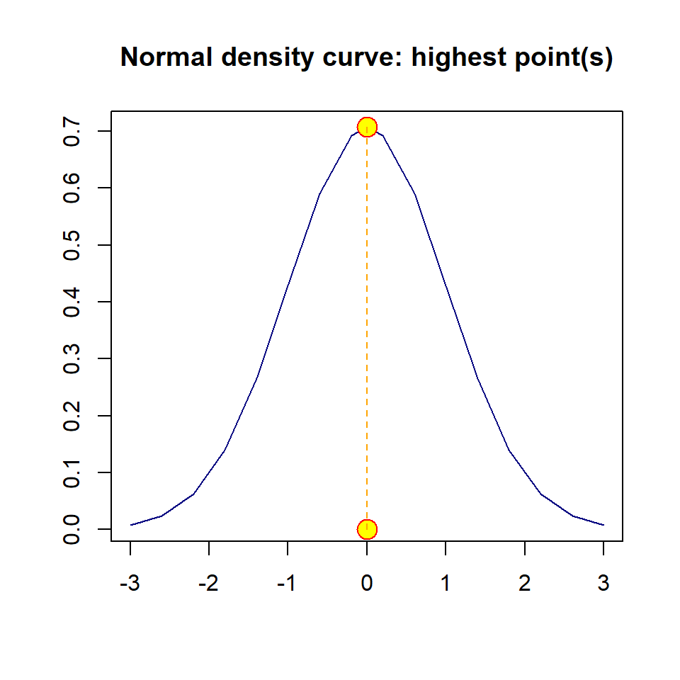
Figure 1.11: Adding points and lines to the base plot
Note: If there are only two points, abline() function will do the same trick. If you only want to draw a straight line with given intercept and slop, use abline() and provide the values of intercept and slope. for example, we can add straight line with slope 0.15 and intercept 0.5, the follow code will add the line to the above graph.
plot(x,y, type = "l", lty = 1, col = "navy", xlab = "", ylab = "",
     main = "Normal density curve: highest point(s)")
## adding pa straight line
abline(0.5, 0.15, lty = 2, col = "red")
## add a vertical line passing through the origin
abline(v = 0, lty = 3, col = "purple4")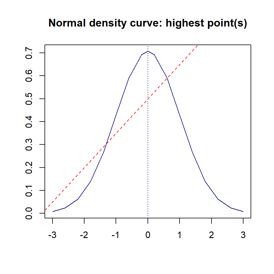
Figure 1.12: Adding a straight line to the base plot with given intercept and slope
1.3.2.3 Add A Legend
If a plot has multiple graphic information, a legend is needed to tell the story. Dependent on the specific plot, we can choose convenient location to place the legend by specifying the x-coordinate and y-coordinate of the center for the legend. There are several special locations that do not need to specify the two coordinates. The following figure shows these special locations.
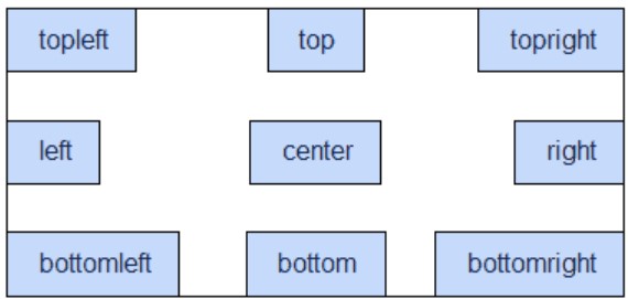
Figure 1.13: Special locations on a plot to place legend and annotations
Next, we add a legend to the above plot. The topleft region is the best location to place the legend.
plot(x,y, type = "l", lty = 1, col = "navy", xlab = "", ylab = "",
     main = "Normal density curve: highest point(s)")
## adding pa straight line
abline(0.5, 0.15, lty = 2, col = "red")
## add a vertical line passing through the origin
abline(v = 0, lty = 3, col = "purple4")
###
legend("topleft", c("density curve", "slant line", "vertical line"), lty=1:3, col = c("navy", "red", "purple4"), cex = 0.6)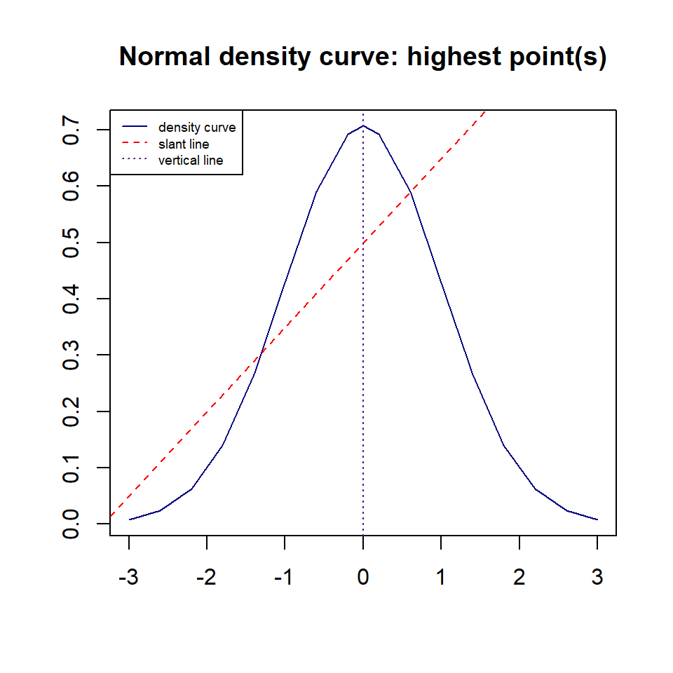
Figure 1.14: Adding a straight line to the base plot with given intercept and slope
1.3.2.4 Add Line Segments, Arrows and annotations
Sometimes, we need to draw straight lines between two points to highlight specific information. If highlight a specific point or specific curve, we may need arrow to point to the point or curve and then make an annotation (to be illustrated next).
plot(x,y, type = "l", lty = 1, col = "navy", xlab = "", ylab = "",
     main = "Normal density curve, straight line and line segment")
## adding pa straight line
points(c(x[3], x[11]), c(y[3], y[11]), pch = 21, col="darkred", bg = "yellow", cex = 1.5)
segments(x[3], y[3], x[11], y[11], lwd = 2, col = "red")
## add a vertical line passing through the origin
abline(v = 0, lty = 3, col = "purple4")
###
legend("topleft", c("density curve", "Line Segment", "vertical line"), lty=1:3, col = c("navy", "red", "purple4"), cex = 0.6)
###
arrows(0.5, 0.2, -0.5, 0.38,  length = 0.1, angle = 25, lty = 1, lwd = 2, col = "blue")
### annotations
text(0.5, 0.15, "line segment", col = "red", cex = 0.8)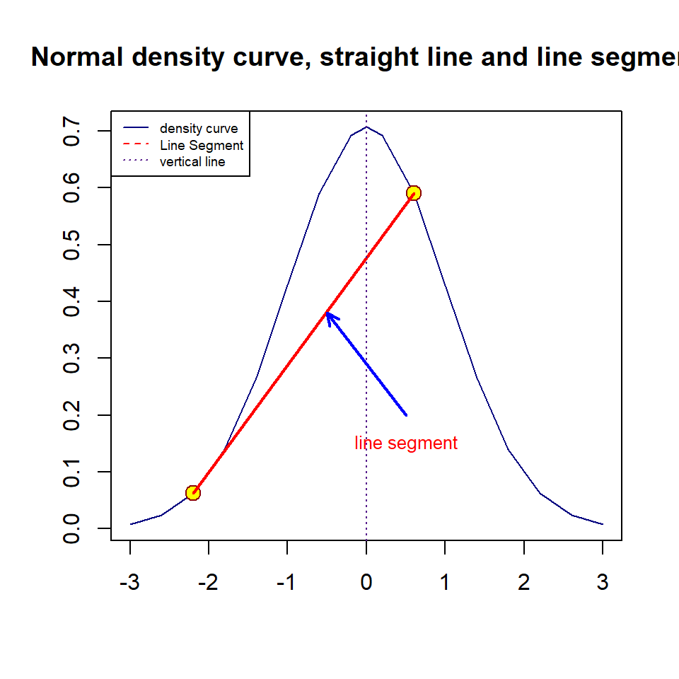
Figure 1.15: curve, straight line, and line segment
1.3.2.5 Additional Arguments in plot()
Sometimes, we may have a long title to explain the plot. R will truncate the long title. This will lead to a partial title. There different ways to get this around. We can change the font size of the title, we could also use multiple line title. For example, we next change the title of the above plot to reflect the information in the plot.
plot(x,y, type = "l", lty = 1, col = "navy", xlab = "", ylab = "",
     main = "Normal density curve, vertical line, line sement, arrows to annotate the straight line")
## adding pa straight line
points(c(x[3], x[11]), c(y[3], y[11]), pch = 21, col="darkred", bg = "yellow",
       cex = 1.5)
segments(x[3], y[3], x[11], y[11], lwd = 2, col = "red")
## add a vertical line passing through the origin
abline(v = 0, lty = 3, col = "purple4")
###
legend("topleft", c("density curve", "Line segment", "vertical line"), lty=1:3,
       col = c("navy", "red", "purple4"), cex = 0.6)
arrows(0.5, 0.2, -0.5, 0.38,  length = 0.1, angle = 25, lty = 1, lwd = 2,
       col = "blue")
### annotations
text(0.5, 0.15, "line segment", col = "red", cex = 0.8)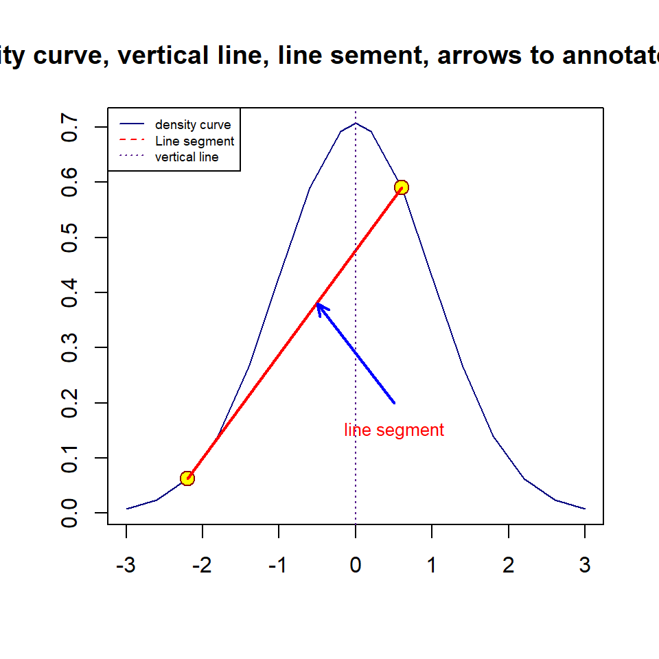
Figure 1.16: Plot with an annotation and long title
We next use multiple line title and modify the font size and color to make a nice title.
plot(x,y, type = "l", lty = 1, col = "navy", xlab = "", ylab = "",
     main = "Normal density curve, vertical line, line sement,
             arrows to annotate the straight line",
     cex.main = 0.8, col.main = "navy")
## adding pa straight line
points(c(x[3], x[11]), c(y[3], y[11]), pch = 21, col="darkred", bg = "yellow",
       cex = 1.5)
segments(x[3], y[3], x[11], y[11], lwd = 2, col = "red")
## add a vertical line passing through the origin
abline(v = 0, lty = 3, col = "purple4")
###  bty = "n" removes the box around the legend!
legend("topleft", c("density curve", "Line segment", "vertical line"), lty=1:3,
       col = c("navy", "red", "purple4"), cex = 0.6, bty = "n")
###
arrows(0.5, 0.2, -0.5, 0.38,  length = 0.1, angle = 25, lty = 1, lwd = 2,
       col = "blue")
### annotations
text(0.5, 0.15, "line segment", col = "red", cex = 0.8)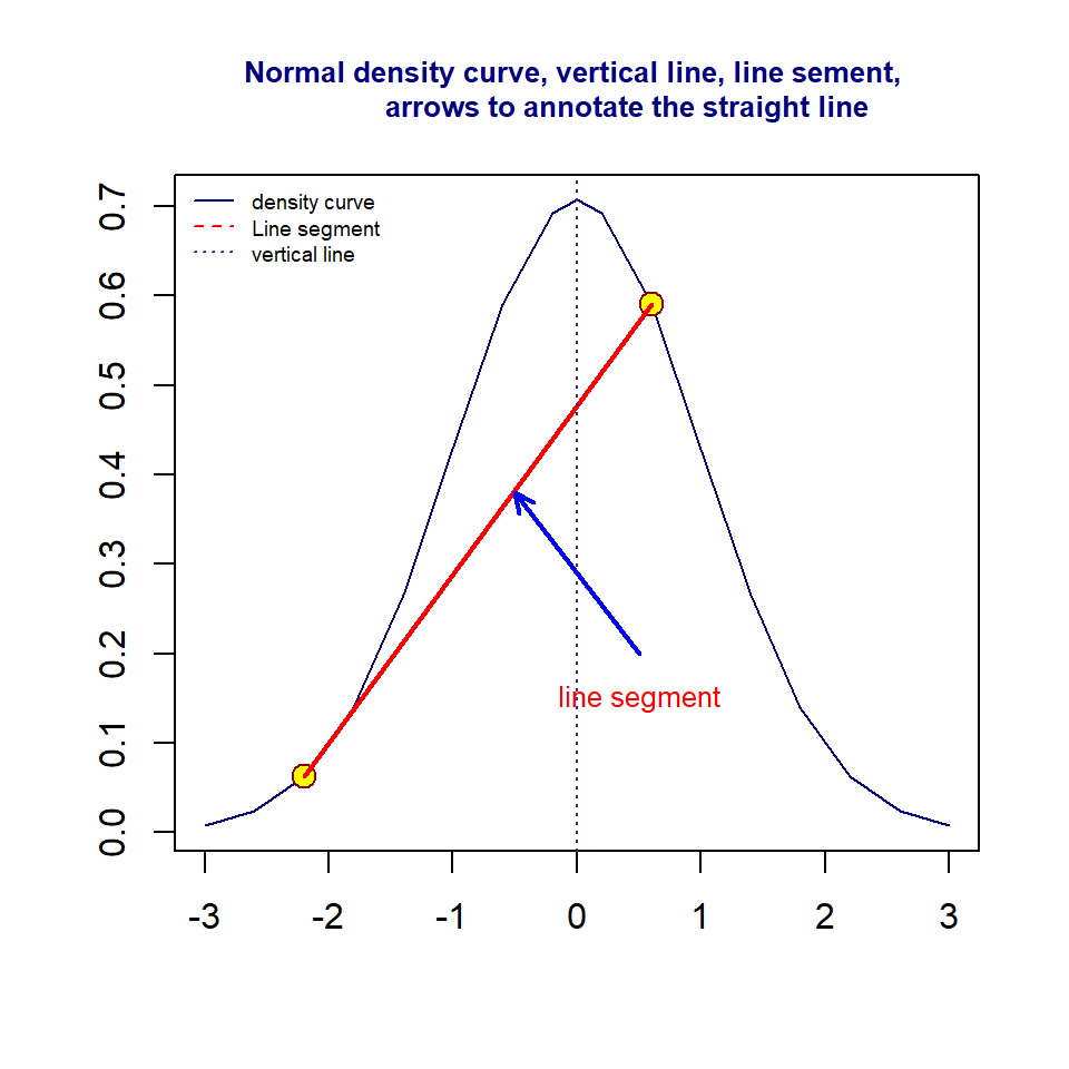
Figure 1.17: Plot with an annotation and long title
With above basics of RMarkdown, LaTex style of mathematics equations, and generic plot functions in R, we should be able to prepare your assignments in a professional digital manner.