```{=html}
```
```{r setup, include=FALSE}
# code chunk specifies whether the R code, warnings, and output
# will be included in the output files.
options(repos = list(CRAN="http://cran.rstudio.com/"))
if (!require("tidyverse")) {
install.packages("tidyverse")
library(tidyverse)
}
if (!require("knitr")) {
install.packages("knitr")
library(knitr)
}
if (!require("cowplot")) {
install.packages("cowplot")
library(cowplot)
}
if (!require("latex2exp")) {
install.packages("latex2exp")
library(latex2exp)
}
if (!require("plotly")) {
install.packages("plotly")
library(plotly)
}
if (!require("gapminder")) {
install.packages("gapminder")
library(gapminder)
}
if (!require("png")) {
install.packages("png") # Install png package
library("png")
}
if (!require("RCurl")) {
install.packages("RCurl") # Install RCurl package
library("RCurl")
}
if (!require("colourpicker")) {
install.packages("colourpicker")
library("colourpicker")
}
if (!require("gifski")) {
install.packages("gifski")
library("gifski")
}
if (!require("magick")) {
install.packages("magick")
library("magick")
}
if (!require("grDevices")) {
install.packages("grDevices")
library("grDevices")
}
### ggplot and extensions
if (!require("ggplot2")) {
install.packages("ggplot2")
library("ggplot2")
}
if (!require("gganimate")) {
install.packages("gganimate")
library("gganimate")
}
if (!require("ggridges")) {
install.packages("ggridges")
library("ggridges")
}
if (!require("graphics")) {
install.packages("graphics")
library("graphics")
}
knitr::opts_chunk$set(echo = TRUE,
warning = FALSE,
result = TRUE,
message = FALSE,
comment = NA)
```
\
# Introduction
The data properties are typically numerical or categorical values, while the visual properties include the x and y positions of points, colors of lines, heights of bars, and so on. The process of creating a data visualization is to map the data properties to visual properties.
In R's base graphics functions, each mapping of data properties to visual properties is its special case. Changing the mappings in the base R graphics may require restructuring the data utilizing completely different plotting commands, or both.
On the other hand, `ggplot2` is a system for declaratively creating graphics, based on The Grammar of Graphics. We provide the data, and tell ggplot2 how to map variables to aesthetics and what graphical primitives to use, `ggplot()` takes care of the details.
The graphic functions in base R are powerful, but in general, it is believed that `ggplot()` is better.
For those who program in Python, It is good to know that `plotnine` is an implementation of a grammar of graphics in **Python**, it is based on `ggplot2()`.
For those who program in SAS, the SAS ODS graphics are roughly analogous to R's `ggplot()` although it is not a direct implementation of The Grammar of Graphics.
# Basics of `ggplot()`
Plotting with `ggplot2` is based on "adding" plot layers and design elements on top of one another, with each command added to the previous ones with a plus symbol (`+`). The result is a multi-layer plot object that can be saved, modified, printed, exported, etc.
`ggplot()` objects can be highly complex, but the basic order of layers will usually look like this:
1. Begin with the baseline `ggplot()` command - this "opens" the ggplot and allows subsequent functions to be added with `+`. Typically the data set is also specified in this command
2. Add `“geom”` layers - these functions visualize the data as geometries (shapes), e.g. as a bar graph, line plot, scatter plot, histogram (or a combination!). These functions all start with `geom_` as a prefix.
3. Add design elements to the plot such as axis labels, titles, fonts, sizes, color schemes, legends, or axes rotation
We can check the tidyverse reference site for more details at
A simple example of skeleton code is as follows. We will explain each component in the code below.
```
# Plot data from my data columns as red points
ggplot(data = my_data) + # use the dataset "my_data"
geom_point( # add a layer of points (dots)
mapping = aes(x = col1, y = col2), # "map" data column to axes
color = "red") + # Other specifications for the geom
labs() + # here you add titles, axes labels, etc.
theme() # here you adjust color, font, size etc
# of non-data plot elements (axes,
# title, etc.)
```
In the following sections, we will detail each of the components in the above code.
# Structure of `ggplot()`
The opening command of any `ggplot2` plot is `ggplot()`. This command simply creates a blank canvas upon which to add layers. It "opens" the way for further layers to be added with a `+` symbol.
Typically, the command ggplot() includes the `data = argument` for the plot. This sets the default data set to be used for subsequent layers of the plot.
This command will end with a `+` after its closing parentheses. This leaves the command "open". The `ggplot` will only execute/appear when the full command includes a final layer **without** a `+` at the end.
```
# This will create a plot that is a blank canvas
ggplot(data = linelist)
```
## Geoms
The above code creates a blank canvas. We need to create geometries (shapes) from our data (e.g. bar plots, histograms, scatter plots, box plots).
This is done by adding layers of "geoms" to the initial `ggplot()` command. Many `ggplot2` functions create "geoms". Each of these functions begins with "geom\_", so we will refer to them generically as `geom_XXXX()`.
There are many geoms in ggplot2 and many others created by fans. View them at the `ggplot2` gallery. Some common `geoms` are listed below:
- Histograms - `geom_histogram()`
- Bar charts - `geom_bar()` or `geom_col()`
- Box plots - `geom_boxplot()`
- Points (e.g. scatter plots) - `geom_point()`
- Line graphs - `geom_line()` or `geom_path()`
- Trend lines - `geom_smooth()`
We can display one or multiple `geoms` in one plot. Each is added to previous `ggplot2` commands with a `+`, and they are plotted sequentially such that later `geoms` are plotted on top of previous ones.
For the complete list of currently available geoms, using the following command in the R Console:
```
ls(pattern = '^geom_', env = as.environment('package:ggplot2'))
```
## AI Generated Desciption of Commonly Used `geoms`
The generative AI (large language model) can help summarize most commonly use `geoms` in ggplot. The following is a list `geoms` with more details based on the phrase **list of geoms in ggplot** through the Microsoft Copilot via Mircosoft Edge:
Geoms are the geometric objects that define the type and appearance of the plots created by the ggplot2 package in R. Geoms can be combined and layered to create complex and customized visualizations of data. Geoms are specified by using geom\_ functions, such as geom_point, geom_bar, geom_line, etc.
There are many geoms available in ggplot2, each with its own aesthetics and parameters. Some of the most common and useful geoms are:
- **geom_point**: This geom draws points on a plot, and can be used to create `scatterplots, dotplots, bubble charts`, etc. It requires x and y aesthetics, and can also take `size, shape, colour, fill` and `alpha` aesthetics to control the appearance of the points.
- **geom_bar** and **geom_col**: These geoms draw bars on a plot, and can be used to create `bar charts, histograms, lollipop charts`, etc. They require x and y aesthetics, where y represents the height of the bars. The difference between `geom_bar` and `geom_col` is that `geom_bar` uses `stat_count` by default, which counts the number of observations in each x group, while `geom_col` uses `stat_identity` by default, which takes the y values as given. These geoms can also take `size, linetype, colour, fill` and alpha aesthetics to control the appearance of the bars.
- **geom_line** and **geom_path**: These geoms draw lines on a plot, and can be used to create `line charts, time series plots, spaghetti plots`, etc. They require x and y aesthetics, where x represents the order of the points along the line. The difference between `geom_line` and `geom_path` is that `geom_line` sorts the data by x before plotting, while `geom_path` plots the data in the order they appear in the data frame. These geoms can also take `size, linetype, colour` and `alpha` aesthetics to control the appearance of the lines.
- **geom_boxplot**: This geom draws boxplots on a plot, and can be used to display the distribution of a numeric variable across different groups. It requires x and y aesthetics, where x represents the grouping variable and y represents the numeric variable. It also uses stat_boxplot by default, which computes the `five-number summary` (minimum, lower quartile, median, upper quartile and maximum) of each group. This geom can also take `size, linetype, colour, fill` and `alpha` aesthetics to control the appearance of the boxplots.
- **geom_histogram**: This geom draws histograms on a plot, and can be used to display the distribution of a single numeric variable. It requires x aesthetic, which represents the numeric variable to be binned. It also uses stat_bin by default, which counts the number of observations in each bin. This geom can also take `size, linetype, colour, fill` and `alpha` aesthetics to control the appearance of the histogram.
- **geom_density** and **geom_density_2d**: These geoms draw density plots on a plot, and can be used to display the distribution of one or two numeric variables using smooth curves. They require x aesthetic for one-dimensional density plots or x and y aesthetics for two-dimensional density plots. They also use `stat_density` or `stat_density_2d` by default, which estimate the probability density function of the variables using kernel smoothing. These geoms can also take `size, linetype, colour, fill` and `alpha` aesthetics to control the appearance of the density plots.
- **geom_tile** and **geom_bin2d**: These geoms draw tiles on a plot, and can be used to create heatmaps or bivariate histograms of two numeric variables. They require x and y aesthetics, which represent the numeric variables to be binned. They also use stat_identity or stat_bin2d by default, which take or compute the values for each tile. These geoms can also take `size, linetype, colour, fill` and `alpha` aesthetics to control the appearance of the tiles.
- **geom_text** and **geom_label**: These geoms draw text or labels on a plot, and can be used to add annotations or data labels to a plot. They require x and y aesthetics for positioning and label aesthetic for text content. They can also take `size, colour, fill, alpha, hjust, vjust` and `parse` aesthetics to control the appearance of the text or labels.
## Mapping Data to Plot
`geom` functions require mapping (assigning) columns in the data to components of the plot like the axes, shape colors, shape sizes, etc. The mappings must be wrapped in the `aes()` function, so we would write something like `mapping = aes(x = col1, y = col2)`.
For example, in the following example using `iris data`, Sepal Length is mapped to the x-axis, and Sepal Width is mapped to the y-axis. After a +, the plotting commands continue. A shape is created with the "geom" function geom_point().
```{r, fig.align='center'}
ggplot(data = iris, mapping = aes(x = Sepal.Length, y = Sepal.Width)) +
geom_point()
```
When creating a histogram, only one variable is used. See the following example.
```{r, fig.align='center'}
ggplot(data = iris, mapping = aes(x = Petal.Width)) +
geom_histogram(binwidth = 0.2)
```
## Arranging Multiple Grobs on the Same Page
In the above subsection, we create two graphs on two different pages. Sometimes, we want to place two more graphs on the same page for comparison purposes. In base R, we have graphic functions such as `par()` and `layout()` to set up a layout for the graphic page.
In this note, we introduce the library `cowplot` to arrange multiple graphical objects (a.k.a `grobs`) on a page.
```{r, fig.align='center'}
## Name the two plots first and then call the two grobs in the layout function
## scatter plot
scatter = ggplot(data = iris, mapping = aes(x = Sepal.Length, y = Sepal.Width)) +
geom_point()
## histogram
hist = ggplot(data = iris, mapping = aes(x = Petal.Width)) +
geom_histogram(binwidth = 0.2)
## use plot_grid() in {cowplot} to layout the two plots
plot_grid(scatter, hist, labels=c("A", "B"), ncol = 2, nrow = 1)
```
## Plot Aesthetics
In `ggplot` terminology a plot "aesthetic" has a specific meaning. It refers to colors, sizes, transparencies, placement, etc. of the plotted data. `Not all geoms will have the same aesthetic options`, but many can be used by most `geoms`.
Here are some examples:
- `shape` = Display a point with `geom_point()` as a `dot`, `star`, `triangle`, or `square`, etc.
- `fill` = The interior color (e.g. of a bar or boxplot)
- `color` = The exterior line of a bar, boxplot, etc., or the point color if using `geom_point()`
- `size` = Size (e.g. line thickness, point size)
- `alpha` = Transparency (1 = opaque, 0 = invisible)
- `binwidth` = Width of histogram bins
- `width` = Width of "bar plot" columns
- `linetype` = Line type (e.g. `solid`, `dashed`, `dotted`)
The aesthetics of plot objects can be assigned values in two ways:
1. Assigned a static value (e.g. color = "blue") to apply across all plotted observations
2. Assigned to a column of the data (e.g. color = hospital) such that the display of each observation depends on its value in that column
We have already added binwidth to the above histogram. Next, we add color to the histogram
```{r, fig.align='center', fig.width=8, fig.height=4}
# Change histogram plot line colors by groups
scatter01 <- ggplot(iris, aes(x = Sepal.Length, y = Sepal.Width,
color = Species,
size = Petal.Width)) +
geom_point(alpha = 0.5)
# Overlaid histograms
hist01 <- ggplot(iris, aes(x = Petal.Width, color=Species)) +
geom_histogram(fill="navy",
alpha = 0.7,
position = "identity",
binwidth = 0.2)
## use plot_grid() in {cowplot} to lay out the two plots
plot_grid(scatter01, hist01, labels=c("A", "B"), ncol = 2, nrow = 1)
```
## Labels in `ggplot()`
Surely you will want to add or adjust the plot's labels. These are most easily done within the `labs()` function which is added to the plot with `+` just as the `geoms` were.
Within `labs()` you can provide character strings to these arguments:
- `x =` and `y =`: The x-axis and y-axis title (labels)
- `title =`: The main plot title
- `subtitle =`: The subtitle of the plot, in smaller text below the title
- `caption =`: The caption of the plot, in bottom-right by default
Here is a plot we made earlier, but with nicer labels:
```{r, fig.align='center'}
ggplot(iris, aes(x = Sepal.Length, y = Sepal.Width,
color = Species,
size = Petal.Width)) +
geom_point(alpha = 0.5) +
labs(
x = "Sepal Length",
y = "Sepal Width",
# label for legends
size = "Sepal Length:",
color = "Species:",
title = "Association between Sepal Length and Width",
subtitle = "This is a partial scatter plot",
caption = paste("Created on", Sys.Date())) +
theme_minimal() # minimal theme
```
# Themes in `ggplot()`
The theme system in `ggplot()` does not affect how the data is rendered by `geoms`, or how it is transformed by scales. `Themes` don't change the perceptual properties of the plot, but they do help you make the plot aesthetically pleasing or match an existing style guide. `Themes` give us control over things like fonts, ticks, panel stripes, and backgrounds.
In other words, when creating the plot we determine how the data is displayed, and then after it has been created we can edit every detail of the rendering, using the theming system.
## Theming System Structure
The theming system is composed of four main components:
- Theme elements specify the non-data elements that we can control. For example,
- `plot.title` controls the appearance of the plot title;
- `axis.ticks.x` controls the ticks on the x-axis;
- `legend.key.height` controls the height of the keys in the legend.
- Each element is associated with an element function, which describes the visual properties of the element. For example, `element_text()` sets the font size, color, and face of text elements like `plot.title`.
- The `theme()` function which allows you to override the default theme elements by calling element functions, like `theme(plot.title = element_text(colour = "red"))`.
- Complete themes, like `theme_grey()` set all of the theme elements to values designed to work together harmoniously.
Here are some especially common theme() arguments. You will recognize some patterns, such as appending .x or .y to apply the change only to one axis.

To get the complete list of themes, run the following code
```{r}
#theme_get()
```
To make sure the plot can stand alone, we need to provide the plot with axes, legend labels, and title, and tweak the color scale for appropriate colors.
```{r, fig.align='center'}
# adding themes
ggplot(iris, aes(x = Sepal.Length, y = Sepal.Width,
color = Species,
size = Petal.Width)) +
geom_point(alpha = 0.5) +
labs(
x = "Sepal Length",
y = "Sepal Width",
# label for legends
size = "Sepal Length:",
color = "Species:",
title = "Association between Sepal Length and Width" ) +
theme_minimal() + # minimal theme
theme( # list of themes applied to the plot
# plot title features
# font family: c("sans", "serif", "mono")
# font face: c("plain", "bold", "italic", "bold.italic")
plot.title = element_text(face = "bold",
size = 12,
family = "sans",
color = "darkred",
hjust = 0.5), # left(0),right(1)
# Labels of axes
axis.title.x = element_text(color = "red",
face = "italic",
family = "serif",
hjust = 0.5),
axis.title.y = element_text(color = "blue",
face = "bold",
vjust = 0.5),
axis.ticks = element_line(color = "red",
size = 0.5),
axis.line = element_line(color = "darkblue",
size = 1,
linetype = "solid"),
# Axis tick marks
axis.text.x = element_text(face="plain",
color="purple",
size=11,
angle=45),
axis.text.y = element_text(face="plain",
color="orange",
size=11,
angle=90),
# Features of legend
legend.background = element_rect(fill = "white",
size = 0.1,
color = "darkgreen"),
legend.justification = c(0.9, 0.8),
legend.position = "bottom",
## Panel grid
panel.grid.major = element_line(color = "lightblue",
size = 0.1),
panel.grid.minor = element_blank()
)
```
## Complete Components of Theme
Themes are a powerful way to customize the `non-data components` of the plots: i.e. titles, labels, fonts, background, gridlines, and legends. To give our plots a consistent customized look, we can define a theme function and call the theme function in any `ggplots`.
The `tidyverse` official website provides a comprehensive document on theme components in \`ggplot\`\`. . Numerous examples have illustrated how to use various theme components.
We can define a theme function that can be reused to customize the plots. For example, we define the following theme and use it in different plots.
```{r, fig.align='center'}
myplot.theme <- function() {
theme(
plot.title = element_text(face = "bold",
size = 12,
family = "sans",
color = "darkred",
hjust = 0.5), # left(0),right(1)
# add border 1)
panel.border = element_rect(colour = "blue",
fill = NA,
linetype = 2),
# color background 2)
panel.background = element_rect(fill = "aliceblue"),
# modify grid 3)
panel.grid.major.x = element_line(colour = "steelblue",
linetype = 3,
size = 0.5),
panel.grid.minor.x = element_blank(),
panel.grid.major.y = element_line(colour = "steelblue",
linetype = 3,
size = 0.5),
panel.grid.minor.y = element_blank(),
# modify text, axis and colour 4) and 5)
axis.text = element_text(colour = "steelblue",
face = "italic",
family = "Times New Roman"),
axis.title = element_text(colour = "steelblue",
family = "Times New Roman"),
axis.ticks = element_line(colour = "steelblue"),
# legend at the bottom 6)
legend.position = "bottom",
legend.key.size = unit(0.6, 'cm'), #change legend key size
legend.key.height = unit(0.6, 'cm'), #change legend key height
legend.key.width = unit(0.6, 'cm'), #change legend key width
legend.title = element_text(size=8), #change legend title font size
legend.text = element_text(size=8)) #change legend text font size
}
```
Now we use the above theme in the following scatter plots. Instead of using the colors based on the value of species, we manually select colors to encode the values of species. The following URL links to a PDF document with colors in R.
```{r, fig.align='center'}
# Change histogram plot line colors by groups
ggplot(iris, aes(x = Sepal.Length, y = Sepal.Width,
color = factor(Species),
size = Petal.Width)) +
geom_point(alpha = 0.5) +
scale_color_manual(values=c("dodgerblue4", "darkolivegreen4","darkorchid3")) +
labs(
x = "Sepal Length",
y = "Sepal Width",
## Color and size of labels
size = "Sepal Length:",
color = "Species:",
title = "Association between Sepal Length and Width") +
myplot.theme()
```
Next, we plot a histogram using the same theme.
```{r, fig.align='center'}
ggplot(iris, aes(x = Petal.Width, color=Species)) +
geom_histogram(fill="navy",
alpha = 0.3,
position = "identity",
binwidth = 0.2) +
scale_color_manual(values=c("dodgerblue4", "darkolivegreen4",
"darkorchid3")) +
labs(
x = "Petal Width",
color = "Species:",
title = "Distribution of Petal Width") +
myplot.theme()
```
# Adding Annotations to Graphics
To make the graphic more informative, sometimes we may want to add annotations to the graphic. If we create a statistical and probabilistic graphic, occasionally we need to add mathematical equations with Greek letters to the graphics.
## Adding Plain Text to Graphics
To add plain text to graphics in ggplot, we use the function `annotate()` with given coordinates. For example, the scatter plot shows two separate groups.
```{r, fig.align='center'}
# Change histogram plot line colors by groups
ggplot(iris, aes(x = Sepal.Length, y = Sepal.Width,
color = factor(Species),
size = Petal.Width)) +
geom_point(alpha = 0.5) +
scale_color_manual(values=c("dodgerblue4", "darkolivegreen4", "darkorchid3")) +
labs(
x = "Sepal Length",
y = "Sepal Width",
## color and size of labels
size = "Sepal Length:",
color = "Species:",
title = "Association between Sepal Length and Width") +
myplot.theme() +
annotate(geom="text",
x=7,
y=4.1,
label=paste("The distribution of Setosa is different",
"from that of Versicolor and Viginica", sep = "\n"),
color="red",
hjust = 0.5)
```
Several other alternatives we can use to add text to graphics created using \`ggplot\`\`.
## Passing Parameters in Annotation
```{r, fig.align='center'}
# Change histogram plot line colors by groups
ggplot(iris, aes(x = Sepal.Length, y = Sepal.Width,
color = factor(Species),
size = Petal.Width)) +
geom_point(alpha = 0.5) +
scale_color_manual(values=c("dodgerblue4", "darkolivegreen4", "darkorchid3")) +
labs(
x = "Sepal Length",
y = "Sepal Width",
## Color and size of labels
size = "Sepal Length:",
color = "Species:",
title = "Association between Sepal Length and Width") +
myplot.theme() +
annotate(geom="text" ,
x=7,
y=4.4,
label=paste("The Pearson correlation coefficient r = ",
round(cor(iris$Sepal.Length, iris$Sepal.Width),3)),
color = "blue")
```
The correlation coefficient between sepal width and sepal length is calculated directly from the data and passed to the annotation in the graphic. Note that we used a very handy and important graphic function `paste()` when adding the annotation.
## Adding Mathematical Equations to Graphics
Mathematical expressions made with the text `geoms` using `parse = TRUE` in `ggplot2` have a format similar to those made with `plotmath()` and `expression()` in base R, except that they are stored as strings, rather than as expression objects.
To mix regular text with expressions, use single quotes within double quotes (or vice versa) to mark the plain-text parts. Each block of text enclosed by the inner quotes is treated as a variable in a mathematical expression.
Bear in mind that, in R's syntax for mathematical expressions, we **can't** simply put a variable right next to another without something else in between. To display two variables next to each other, put a `*` operator between them. when `*` is displayed in a graphic, it is treated as an invisible multiplication sign (for a visible multiplication sign, use `%*%`):
```{r, fig.align='center'}
x.axis <- seq(0, 20, length.out = 100)
y.axis <- (1/sqrt(2*pi)*3)*exp(-(x.axis-10)^2/(2*9))
normal.data = data.frame(x=x.axis , y=y.axis)
##
ggplot(normal.data, aes(x = x.axis, y = y.axis)) +
geom_line(color = "blue") +
coord_cartesian(ylim = c(0, 1.25), xlim=c(0,20)) +
labs(
x = "Normal Score",
y = "Normal Density",
title = "Normal Density Curve") +
annotate("text", x = 10, y = 0.2,
parse = TRUE, size = 4,
label = "'Function: ' * y==frac(1, sqrt(2*pi)* sigma) %*% e^{-(x- mu)^2/2}",
color = "red")
```
## Adding Images to Existing ggPlots
To embed a PNG image to an existing graph created by `ggplot`, we need to use `readPNG()` in library **png** to load the image to R and `getURLcontent()` in the **RCurl** to insert the image to the graph.
```{r, fig.align='center'}
# caturl <- "https://stat553.s3.amazonaws.com/ggplot/cat.png"
caturl <- "https://raw.githubusercontent.com/pengdsci/sta553/main/ggplot/cat.png"
my_cat <- readPNG(getURLContent(caturl))
raster.cat <- as.raster(my_cat)
# Change histogram plot line colors by groups
ggplot(iris, aes(x = Sepal.Length, y = Sepal.Width,
color = factor(Species),
size = Petal.Width)) +
geom_point(alpha = 0.5) +
labs(
x = "Sepal Length",
y = "Sepal Width",
## Color and size of labels
size = "Sepal Length:",
color = "Species:",
title = "Association between Sepal Length and Width") +
myplot.theme() +
annotation_raster(raster.cat, 4, 4.85, 3.65, 4.5)
```
# Removing Chart Junks Via Themes
We remove some unnecessary marks and channels from the chart via theme: change the background color, grid, and plot title. Essentially, we use a them to lay out a ggplot style without any chart junk.
```{r, fig.align='center'}
myplot.theme_new <- function() {
theme(
#ggplot margins
plot.margin = margin(t = 50, # Top margin
r = 30, # Right margin
b = 30, # Bottom margin
l = 30), # Left margin
## ggplot titles
plot.title = element_text(face = "bold",
size = 12,
family = "sans",
color = "navy",
hjust = 0.5,
margin=margin(0,0,30,0)), # left(0),right(1)
# add border 1)
panel.border = element_rect(colour = NA,
fill = NA,
linetype = 2),
# color background 2)
panel.background = element_rect(fill = "#f6f6f6"),
# modify grid 3)
panel.grid.major.x = element_line(colour = 'white',
linetype = 3,
size = 0.5),
panel.grid.minor.x = element_blank(),
panel.grid.major.y = element_line(colour = 'white',
linetype = 3,
size = 0.5),
panel.grid.minor.y = element_blank(),
# modify text, axis and colour 4) and 5)
axis.text = element_text(colour = "navy",
#face = "italic",
size = 7,
#family = "Times New Roman"
),
axis.title = element_text(colour = "navy",
size = 7,
#family = "Times New Roman"
),
axis.ticks = element_line(colour = "navy"),
# legend at the bottom 6)
legend.position = "bottom",
legend.key.size = unit(0.6, 'cm'), #change legend key size
legend.key.height = unit(0.6, 'cm'), #change legend key height
legend.key.width = unit(0.6, 'cm'), #change legend key width
#legend.title = element_text(size=8), #change legend title font size
legend.title=element_blank(), # remove all legend titles
legend.key = element_rect(fill = "white"),
#####
legend.text = element_text(size=8)) #change legend text font size
}
```
Using the above theme, we re-plot the iris data with less irrelevant graphical elements.
```{r, fig.align='center', fig.width=6, fig.height=5}
# Change histogram plot line colors by groups
ggplot(iris, aes(x = Sepal.Length, y = Sepal.Width,
color = factor(Species)), linetype = Species) +
geom_point(size = 2, alpha = 0.7) +
stat_smooth(method = lm, se=FALSE, size = 0.3) +
scale_color_manual(values=c("dodgerblue4", "darkolivegreen4", "darkorchid3")) +
labs(
x = "Sepal Length",
y = "Sepal Width",
## labels of color and size
#size = "Sepal Length",
#color = NA,
title = "Association between Sepal Length and Width") +
myplot.theme_new() +
annotate(geom="text" ,
x=6.8,
y=2,
label=paste("The Pearson correlation coefficient r = ",
round(cor(iris$Sepal.Length, iris$Sepal.Width),3)),
size = 2,
color = "navy") +
coord_fixed(1) ## This changes the aspect ratio of the graph
```
# Common Extensions to `ggplot`
There are different extensions of `ggplot`. This section introduces two commonly used extensions. We will also briefly outline a few other extensions of `ggplot`.
## Aminated Graph with `gganimate()`
`gganimate()` extends the grammar of graphics as implemented by `ggplot2` to include the description of animation. It does this by providing a range of new grammar classes that can be added to the plot object in order to customize how it should change with time.
- `transition_*()` defines how the data should be spread out and how it relates to itself across time.
- `view_*()` defines how the positional scales should change along with the animation.
- `shadow_*()` defines how data from other points in time should be presented in the given point in time.
- `enter_*()/exit_*()` defines how new data should appear and how old data should disappear during the course of the animation.
- `ease_aes()` defines how different aesthetics should be eased during transitions.
The logic behind the `gganimate` is to create a sequence of images and then make a gif image. We need to write HTML to include this gif in the RMarkdown document.
```{r, fig.align='center'}
library(gapminder)
p <- ggplot(gapminder, aes(x = gdpPercap,
y=lifeExp,
size = pop,
colour = country)) +
geom_point(aes(size = pop, ids = country ),
show.legend = FALSE,
alpha = 0.7) +
scale_color_viridis_d() + # color pallets
scale_size(range = c(2, 12)) +
scale_x_log10() +
labs(x = "GDP per capita",
y = "Life expectancy") +
## gganimate command
transition_time(year)
##
anim_save("LifeExp.gif", p)
# animate(p, renderer = gifski_renderer()) # This command will pop up a new graphic window showing the animation.
```

Since the gif image is made of individual static images, it is different from the interactive plot presented in the previous sections that have the capability of showing mode information of the data via hover message.
The next gif graph consists of 5 panels, each representing a continent. They are also fig images. Therefore, no hover message is available for these gif figures.
We use the {gifki} package to render the images in the form of gif and then include the gif image into the RMarkdown document directly.
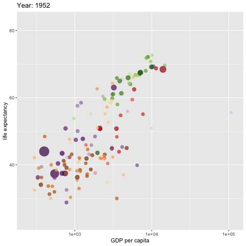
```{r, fig.align='center'}
w <- ggplot(gapminder, aes(gdpPercap, lifeExp,
size = pop, colour = country)) +
geom_point(alpha = 0.7, show.legend = FALSE) +
scale_colour_manual(values = country_colors) +
#scale_color_manual(values=c("dodgerblue4", "darkolivegreen4","darkorchid3")) +
#scale_color_brewer(palette="Set1") +
scale_size(range = c(2, 12)) +
scale_x_log10() +
# break down the previous single plot by continent
# facet_wrap(~continent) + # create multiple panels according to the continents
# Here comes the gganimate specific bits
labs(title = 'Year: {frame_time}',
x = 'GDP per capita',
y = 'life expectancy') +
transition_time(year) +
ease_aes('linear')
###
animate(w, renderer = gifski_renderer(),
rewind = TRUE)
```
The above code does not save the generated gif image to the document folder (directory). If need to save it from the viewer window to the designated folder and then embed it to a web page created by tools other than the RMarkdown.
```
```
Next, we create a group gif using facet_wrap() function. The code is the same as the above example except for one additional function call.
```{r, fig.align='center'}
w <- ggplot(gapminder, aes(gdpPercap, lifeExp,
size = pop, colour = country)) +
geom_point(alpha = 0.7, show.legend = FALSE) +
scale_colour_manual(values = country_colors) +
#scale_color_manual(values=c("dodgerblue4", "darkolivegreen4","darkorchid3")) +
#scale_color_brewer(palette="Set1") +
scale_size(range = c(2, 12)) +
scale_x_log10() +
# break down the previous single plot by continent
facet_wrap(~continent) + # create multiple panels according to the continents
# Here comes the gganimate-specific bits
labs(title = 'Year: {frame_time}',
x = 'GDP per capita',
y = 'life expectancy') +
transition_time(year) +
ease_aes('linear')
###
animate(w, renderer = gifski_renderer(),
rewind = TRUE)
```
## Ridgetline Plot with `ggridges` Library
The ridgeline plot is a useful 3D to compare multiple densities. It creates a 3D impression and has gained increasing popularity. Here we use the California Housing Data that is available on the Project Data Set .
```{r fig.align='center'}
CalHousing = read.csv("https://raw.githubusercontent.com/pengdsci/sta553.html/main/data/ca-housing-price.csv")
ggplot(CalHousing, aes(x = median_house_value, y = ocean_proximity, fill = ocean_proximity)) +
geom_density_ridges()
```
You can pass `stat(x)` or `factor(stat(x))` to the fill argument of `aes` and use `geom_density_ridges_gradient` and a continuous fill color scale to fill each ridgeline with a gradient.
```{r fig.align='center'}
ggplot(CalHousing, aes(x = median_house_value, y = ocean_proximity, fill = stat(x))) +
geom_density_ridges_gradient(jittered_points = TRUE,
position = position_points_jitter(width = 0.05, height = 0),
point_shape = '|', point_size = 1, point_alpha = 1, alpha = 0.3,) +
scale_fill_viridis_c(name = "median_house_value", option = "C")
```
Next, we explore the distribution of continuous variables in the iris data set. As an example, we make the following ridgeline plot to see the distribution of sepal widths across the species.
```{r fig.align='center'}
ggplot(iris, aes(x = Sepal.Width, y = Species, fill = stat(x))) +
geom_density_ridges_gradient(jittered_points = TRUE,
position = position_points_jitter(width = 0.05, height = 0),
point_shape = '|', point_size = 1, point_alpha = 1, alpha = 0.3,) +
scale_fill_viridis_c(name = "Sepal Width", option = "C")
```
The above distributions have similar shapes (variations) but with different means. This also indicates the ANOVA model between sepal width and species is appropriate.
## Other Extensions to ggplot
We have used ggplot extensions **{gganimate}** to create animated graphs and **{ggridges}** to create ridgeline graphs to compare multiple densities. There are several other important ggplot extensions that enhance the basic ggplots.
- ggdendro - controls the appearance and display of your cluster analyses
- ggthemes - contains themes and scales that enhance the standard ggplots.
- ggpubr - makes it easy to produce publication-ready plots using ggplot.
- Plotly - brings interactivity to ggplots. We will spend a week on plotly().
- patchwork - arranges multiple R plots on the same graphics page
- ggmap - is a powerful package for visualizing spatial data and models. It layers data on top of static maps from popular online sources. We will use these packages to make maps later.
- ggrepel - gives ggplot2 users greater control over how text labels appear in their charts.
- ggcorrplot - controls the appearance of the matrix, from altering the color, shape, or size of the boxes (as in the circle-matrix above), to adding coefficient labels, reordering the matrix according to hierarchical clustering, and so on.
- GGally - brings together many useful additional visualization functionality, all in one package.
- ggiraph -is an htmlwidget that can be extended to an existing ggplot2 such as bar chart, scatterplot, boxplot, map, etc., and does things like displaying a tooltip of your choice.
# Save `ggplot` Images
A `ggplot` can be saved to different file formats, including PDF, SVG vector files, PNG, TIFF, JPEG, etc.
We can either print directly a `ggplot` into `PNG/PDF` files or use the convenient function `ggsave()` for saving a `ggplot`.
The default of `ggsave()` is to export the last plot that you displayed, using the size of the current graphics device. It also guesses the type of graphics device from the extension.
## General Steps
The standard procedure to save any graphics from R is as follows:
- Open a graphic device using one of the following functions:
- `pdf(“r-graphics.pdf”)`,
- `svg(“r-graphics.svg”)`,
- `png(“r-graphics.png”)`,
- `tiff(“r-graphics.tiff”)`,
- `jpeg(“r-graphics.jpg”)`, etc.
- Additional arguments indicating the width and the height (in inches) of the graphics region can be also specified in the mentioned function.
- Create and print a plot. Close the graphic device using the function `dev.off()`.
## Save `ggplot` into a PDF File
The following code illustrates how to save a ggplot in a folder in PDF format.
```{r, fig.align='center'}
# scatter plots
iris.scatter <- ggplot(iris, aes(Sepal.Length, Sepal.Width)) +
geom_point()
## box-plot
iris.boxplot <- ggplot(iris, aes(Species, Sepal.Length)) +
geom_boxplot()
# Print plots to a PDF file: one page per PDF file
pdf("savePDFggplot.pdf") # Save the PDF file in ggplot folder.
print(iris.scatter) # Plot 1 --> in the first page of PDF
print(iris.boxplot) # Plot 2 ---> in the second page of the PDF
dev.off()
```
## Save ggplot with `ggsave()`
It's also possible to make a ggplot and save it from the screen using the function `ggsave()`.
```{r, fig.align='center'}
# 1. Create a plot: displayed on the screen (by default)
ggplot(mtcars, aes(wt, mpg)) + geom_point()
# 2.1. Save the plot to a pdf
ggsave("mtcarmyplot.pdf")
# 2.2 OR save it to png file
ggsave("mtcarmyplot.png")
```
We can also save multiple plots in the sample format to a single file. We can use `plot_grid()` in **{cowplot}** to make two figures on the same graphic page and then use `ggsave()` to save it to a single file.
```{r}
#
p1 <- ggplot(mtcars, aes(wt, mpg)) + geom_point()
p2 <- ggplot(mtcars, aes(wt)) + geom_histogram()
combinedPlot <- plot_grid(p1, p2, labels=c("A", "B"), ncol = 2, nrow = 1)
##
ggsave("CombinedPlot.png", plot = combinedPlot)
```
# The Role of Color in Effective Visualization
Substantial research shows that color plays a pivotal role in our visual experiences. In this class, we use colors for two main purposes: encoding and highlighting information.
We use different colors to denote different values of a variable. There are many continuous and discrete color palettes available in different R libraries that can be used on different occasions. However, we need to pay very special attention to the cases when colors are used for encoding because we see colors differently - people with vision deficiency are less sensitive to some of the colors. The next figure illustrates the major types of color blindness.
```{r fig.align = 'center', out.width = '80%'}
include_graphics("ColorBlindnessTypes.png")
```
What colors should you use? There are different color-picker tools available for us to choose colors while making sure that the color palette is accessible. Here is a set of 8 pairs of contrasting colors that maintain their contrast for people who are colorblind.
```{r fig.align = 'center', out.width = '80%'}
include_graphics("r-color-palettes.png")
```
For example, the following three sample palettes are colorblind-friendly.
- **IBM Design Library**
```{r fig.align='center', fig.width=7, fig.height=1}
par(mfrow=c(1,5), oma=c(0,0,0,0), mar = c(1,0.5,1,0.5))
plot(NULL, type="n", xlim=c(-1,1), ylim=c(-1,1), axes = FALSE, xlab = "", ylab = "")
rect(xleft = -1, ybottom = -0.5, xright =1, ytop = 0.5, lty = 1, col = "#648FFF")
text(0,0, "#648FFF")
##
plot(NULL, type="n", xlim=c(-1,1), ylim=c(-1,1), axes = FALSE, xlab = "", ylab = "")
rect(xleft = -1, ybottom = -0.5, xright =1, ytop = 0.5, lty = 1, col = "#785EF0")
text(0,0, "#785EF0")
##
plot(NULL, type="n", xlim=c(-1,1), ylim=c(-1,1), axes = FALSE, xlab = "", ylab = "")
rect(xleft = -1, ybottom = -0.5, xright =1, ytop = 0.5, lty = 1, col = "#DC267F")
text(0,0, "#DC267F")
##
plot(NULL, type="n", xlim=c(-1,1), ylim=c(-1,1), axes = FALSE, xlab = "", ylab = "")
rect(xleft = -1, ybottom = -0.5, xright =1, ytop = 0.5, lty = 1, col = "#FE6100")
text(0,0, "#FE6100")
##
plot(NULL, type="n", xlim=c(-1,1), ylim=c(-1,1), axes = FALSE, xlab = "", ylab = "")
rect(xleft = -1, ybottom = -0.5, xright =1, ytop = 0.5, lty = 1, col = "#FFB000")
text(0,0, "#FFB000")
```
- **Wong's Palette**
```{r fig.align='center', fig.width=7, fig.height=1}
par(mfrow=c(1,8), oma=c(0,0,0,0), mar = c(1,0.5,1,0.5))
plot(NULL, type="n", xlim=c(-1,1), ylim=c(-1,1), axes = FALSE, xlab = "", ylab = "")
rect(xleft = -1, ybottom = -0.5, xright =1, ytop = 0.5, lty = 1, col = "#000000")
text(0,0, "#000000", col = "white")
##
plot(NULL, type="n", xlim=c(-1,1), ylim=c(-1,1), axes = FALSE, xlab = "", ylab = "")
rect(xleft = -1, ybottom = -0.5, xright =1, ytop = 0.5, lty = 1, col = "#E69F00")
text(0,0, "#E69F00")
##
plot(NULL, type="n", xlim=c(-1,1), ylim=c(-1,1), axes = FALSE, xlab = "", ylab = "")
rect(xleft = -1, ybottom = -0.5, xright =1, ytop = 0.5, lty = 1, col = "#56B4E9")
text(0,0, "#56B4E9")
##
plot(NULL, type="n", xlim=c(-1,1), ylim=c(-1,1), axes = FALSE, xlab = "", ylab = "")
rect(xleft = -1, ybottom = -0.5, xright =1, ytop = 0.5, lty = 1, col = "#009E73")
text(0,0, "#009E73")
##
plot(NULL, type="n", xlim=c(-1,1), ylim=c(-1,1), axes = FALSE, xlab = "", ylab = "")
rect(xleft = -1, ybottom = -0.5, xright =1, ytop = 0.5, lty = 1, col = "#F0E442")
text(0,0, "#F0E442")
##
plot(NULL, type="n", xlim=c(-1,1), ylim=c(-1,1), axes = FALSE, xlab = "", ylab = "")
rect(xleft = -1, ybottom = -0.5, xright =1, ytop = 0.5, lty = 1, col = "#0072B2")
text(0,0, "#0072B2")
##
plot(NULL, type="n", xlim=c(-1,1), ylim=c(-1,1), axes = FALSE, xlab = "", ylab = "")
rect(xleft = -1, ybottom = -0.5, xright =1, ytop = 0.5, lty = 1, col = "#D55E00")
text(0,0, "#D55E00")
##
plot(NULL, type="n", xlim=c(-1,1), ylim=c(-1,1), axes = FALSE, xlab = "", ylab = "")
rect(xleft = -1, ybottom = -0.5, xright =1, ytop = 0.5, lty = 1, col = "#CC79A7")
text(0,0, "#CC79A7")
```
- **Pal's Pallete**
```{r fig.align='center', fig.width=7, fig.height=1}
par(mfrow=c(1,8), oma=c(0,0,0,0), mar = c(1,0.5,1,0.5))
plot(NULL, type="n", xlim=c(-1,1), ylim=c(-1,1), axes = FALSE, xlab = "", ylab = "")
rect(xleft = -1, ybottom = -0.5, xright =1, ytop = 0.5, lty = 1, col = "#332288")
text(0,0, "#332288", col = "white")
##
plot(NULL, type="n", xlim=c(-1,1), ylim=c(-1,1), axes = FALSE, xlab = "", ylab = "")
rect(xleft = -1, ybottom = -0.5, xright =1, ytop = 0.5, lty = 1, col = "#117733")
text(0,0, "#117733")
##
plot(NULL, type="n", xlim=c(-1,1), ylim=c(-1,1), axes = FALSE, xlab = "", ylab = "")
rect(xleft = -1, ybottom = -0.5, xright =1, ytop = 0.5, lty = 1, col = "#44AA99")
text(0,0, "#44AA99")
##
plot(NULL, type="n", xlim=c(-1,1), ylim=c(-1,1), axes = FALSE, xlab = "", ylab = "")
rect(xleft = -1, ybottom = -0.5, xright =1, ytop = 0.5, lty = 1, col = "#88CCEE")
text(0,0, "#88CCEE")
##
plot(NULL, type="n", xlim=c(-1,1), ylim=c(-1,1), axes = FALSE, xlab = "", ylab = "")
rect(xleft = -1, ybottom = -0.5, xright =1, ytop = 0.5, lty = 1, col = "#DDCC77")
text(0,0, "#DDCC77")
##
plot(NULL, type="n", xlim=c(-1,1), ylim=c(-1,1), axes = FALSE, xlab = "", ylab = "")
rect(xleft = -1, ybottom = -0.5, xright =1, ytop = 0.5, lty = 1, col = "#CC6677")
text(0,0, "#CC6677")
##
plot(NULL, type="n", xlim=c(-1,1), ylim=c(-1,1), axes = FALSE, xlab = "", ylab = "")
rect(xleft = -1, ybottom = -0.5, xright =1, ytop = 0.5, lty = 1, col = "#AA4499")
text(0,0, "#AA4499")
##
plot(NULL, type="n", xlim=c(-1,1), ylim=c(-1,1), axes = FALSE, xlab = "", ylab = "")
rect(xleft = -1, ybottom = -0.5, xright =1, ytop = 0.5, lty = 1, col = "#882255")
text(0,0, "#882255", col = "white")
```
We can find more R color palettes from .
As an example, we use the above color blind friendly color scheme and draw various density curves.
```{r fig.align='center', fig.width=6, fig.height=4}
iris0 = iris
Type = c(paste(iris$Species,".Sepal.Length", sep = ""),paste(iris$Species,".Sepal.Width", sep = ""))
Measure = c(iris$Sepal.Length ,iris$Sepal.Width)
irisNew = data.frame(Type = Type, Measure = Measure)
cols1 = c("#332288","#117733","#44AA99","#88CCEE","#DDCC77","#CC6677")
cols3 = c("#AA4499","#882255")
p = ggplot() +
geom_density(data = irisNew, aes(x = Measure, color = Type), lwd = 1) +
scale_color_manual(values = cols1) +
ggtitle("Multiple Density Curves") +
theme(plot.title = element_text(hjust = 1,
face = "bold",
color = "navy"))
p
```
Some people like filled density curves. `alpha` is a function in the library of `ggplot2`.
```{r}
p1 = ggplot(data = irisNew, aes(x = Measure, color = Type, fill = Type)) +
geom_density(alpha = 0.25, lwd = 1.5) +
scale_fill_manual(values = cols1) +
ggtitle("Multiple Filled Density Curves") +
theme(plot.title = element_text(hjust = 1,
face = "bold",
color = "purple"))
p1
```