|
Please show your work before checking the answer and explanations. The questions in the exams will be similar to these exercises.
Problem 1. The following bar graph presents the average amount a certain family spent, in dollars, on various food categories in a recent year.
On which food category was the most money spent?
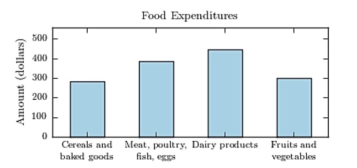
A) Dairy products
B) Fruits and vegetables
C) Meat poultry, fish, eggs
D) Cereals and baked goods
View Answer
Ans : A
Explanation: The category with the highest vertical bar was the most money spent.
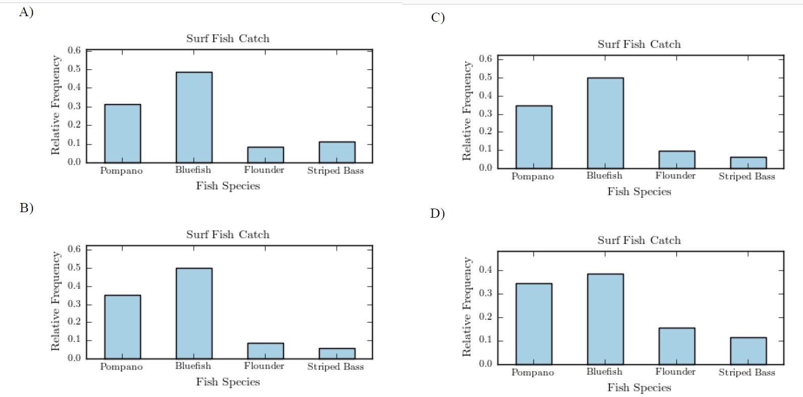
Problem 2. The following pie chart presents the percentages of fish caught in each of four ratings categories.
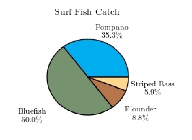
Match this pie chart with its corresponding bar graph in the following.
View Answer
Ans : B
Explanation: The heights of the vertical bar are equal to the size corresponding sliced pies.
Problem 3. The following frequency distribution presents the frequency of passenger vehicles that pass
through a certain intersection from 8:00 AM to 9:00 AM on a particular day.
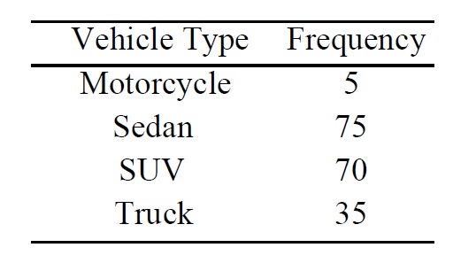
Construct a frequency bar graph for the data.
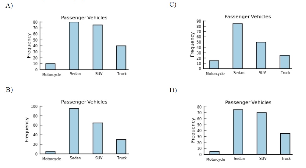
View Answer
Ans : D
Explanation: Checking the height of the vertical bars to find the correct bar chart.
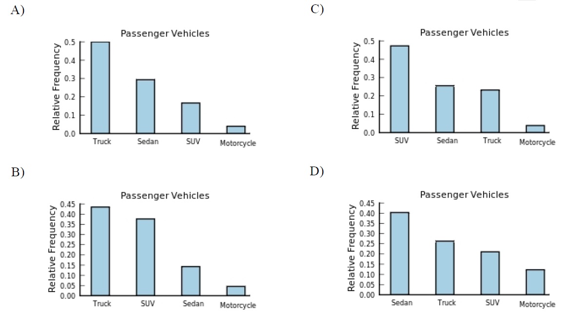
Problem 4. The following frequency distribution presents the frequency of passenger vehicles that pass
through a certain intersection from 8:00 AM to 9:00 AM on a particular day.
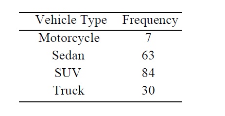
Construct a relative frequency distribution for the data.
View Answer
Ans : A
Explanation: The total is 184. You can calculate the relative frequencies 7/184, 63/184, 84/184, 30/184 to find the correct freuency table. You can also use exclusion method find the correct frequency table. For example, B) is not incorrect since the sum of the relative freuency is not equal to 1. The highest relative frequency is 84/184 < 0.5. Therefore, C) and D) are incorrect. Hence A is correct!
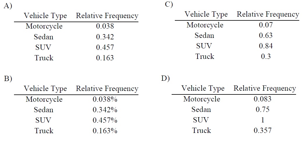
Problem 5. The following frequency distribution presents the frequency of passenger vehicles that pass
through a certain intersection from 8:00 AM to 9:00 AM on a particular day.
Construct a relative frequency Pareto chart for the data.
View Answer
Ans : B
Explanation: The total is 184. You can calculate the relative frequencies 7/157, 22/157, 58/184, 67/157 to find the correct bar chart. The easiest way is to R to calculate these relative frequecies by typing command: c(7/157, 22/157, 58/184, 67/157) in the R Console.
Problem 6. Classify the histogram as skewed to the left, skewed to the right, or approximately symmetric.
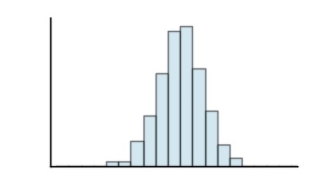
A) skewed to the right
B) approximately symmetric
C) skewed to the left
View Answer
Ans : B
Explanation: obvious.
Problem 7. One hundred students are shown an eight-digit number on a piece of cardboard for three seconds
and are asked to then recite the number from memory. The process is repeated until the student
accurately recites the entire number from memory. The following histogram presents the
number of trials it took each student to memorize the number.
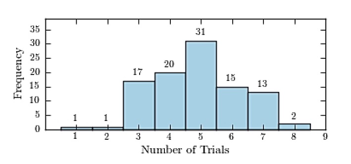
How many students memorized the number in three trials or less?
A) 2
B) 81
C) 24
D) 19
View Answer
Ans : D
Explanation: The sum of the heights of left three vertical bars: 1 + 1 + 17 = 19.
Problem 8. The following frequency distribution presents the weights in pounds (lb) of a sample of visitors to a health clinic.
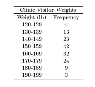
Construct a relative frequency histogram.
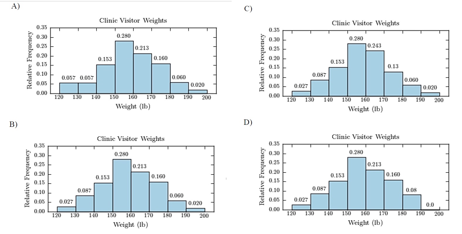
View Answer
Ans : B
Explanation: Note that 4 + 13 + 23 + 42 + 32 + 24 + 9 + 3 = 150. You can calculate the relative frequencies (4/150, 13/150, 23/150, 42/150, 32/150, 24/150, 9/150, 3/150) to find the correct bar chart. You can also use R to find the relative freuencies quickly.
Problem 9. The following table presents the purchase totals (in dollars) of a random sample of gasoline
purchases at a convenience store.
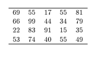
Construct a frequency histogram using a class width of 10, and using 0 as the lower class
limit for the first class.
View Answer
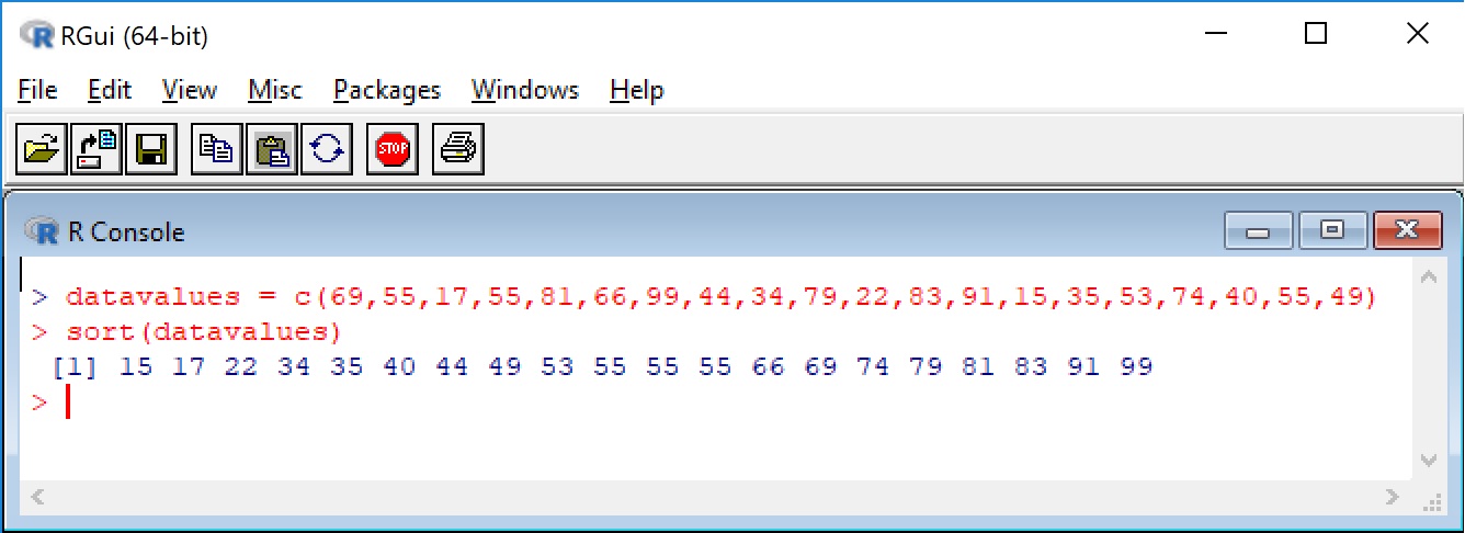
Ans : A
Explanation: Using the exclusion method by counting the frequencies in each intervals. To save time, you can sort the data values in an asecending order first before counting. In R, you simply use command sort() to get the sorted value quickly. See the following screen shot that shows how to use R to sort data values.
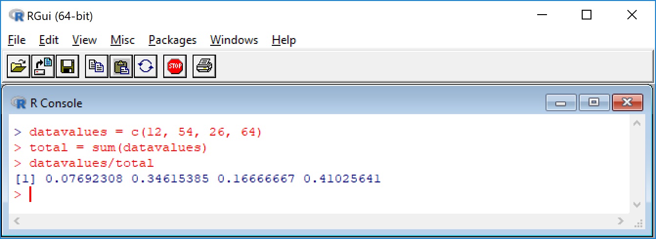
Problem 10. The following frequency distribution presents the frequency of passenger vehicles that pass
through a certain intersection from 8:00 AM to 9:00 AM on a particular day.
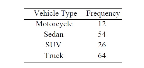
Construct a pie chart for the data.
View Answer
Ans : B
Explanation: Note that 12 + 54 + 26 + 64 = 156. The corresponding relative freuencies are calculated by
(12/156, 54/156, 26/156, 64/156). The following screen shot shows how to calculate these relative frequencies.
|